This post gives test results for HadUK-GRID, monthly average Tmax at 1 km resolution.
The following figure shows how the dataset construction begins with station data, which appears to be extrapolated both forward and backwards in time to cover the entire period from 1884 to 2024.
The station data shown are for Bedford and very nearby Cardington, whose monthly average data has been concatenated to create a single series, shown in red. When the Cardington station closed in 1980 the Bedford station began operation. The Cardington station resumed operation in 2022, but this data are not shown.
This pair of stations was chosen because there is an exceptionally large change in temperature between them, revealing the temperature difference between the closest 1 km grid points to the latest station positions, shown in blue and black.
One conclusion from the figure above is that HadUK-GRID data cannot be used to get temperature gradients over short distances.
This post gives the results of a visual validation performed on a new version (v2) of the Central England Temperature (CET) series, at the level of monthly averages of Tmax and Tmin. The new version is known as HadCETv2, and is available from the UK Met Office website, which also lists papers written about CET.
The map above shows the areas used in regional averages of HadUK-GRID. The Midlands regional averages are used as Reference Series in this analysis. The approximate locations of the three sub-series used in CET are shown in red.
HadCETv2 is formed as an average of three sub-series, composed of the stations shown in the following diagram:
The visual validation procedure is a comparison of changes in the net adjustments, against changes in the net raw data, at the level of 12-month moving averages. The net adjustments are obtained as RAW – CET, where RAW is the average of the raw data for the stations shown above, and where CET is HadCETv2. The changes in the net raw data are obtained as RAW – REF, where REF (Reference Series) is HadUK-GRID-MIDLANDS, with the MIDLANDS area shown in the figure above. The raw data was obtained from MIDAS-OPEN via CEDA, HadUK-GRID-MIDLANDS data was obtained from a Met Office website.
The visual comparison is facilitated by offsetting the two series of data to a common mean over a selected period, indicated in green in the following figures:
TMAX: The Tmax figure above shows the following:
The adjustments applied for the 2004 change in station composition are too small, by a factor of around 2
There is no need for the urbanisation correction applied from 1974 to 2004. This is more visible in the Tmin data
The raw data used in HadCET before 1958 are poor, with frequent perturbations. The data used after that date are much better in this respect
TMIN: The Tmin figure above shows the following:
There is no need for the urbanisation correction applied from 1974 to 2004
There may be a need for a correction at around 2016, this is investigated below
There is a mis-match between adjustments and raw data from around 1940 to 1958
Much of the inconsistency between HadCETv2 and HadUK(Midlands) (shown in black) is due to the issues cited above. If amendments were made to the adjustments, to fix the issues cited above, there would be much greater consistency.
RAW DATA ANALYSIS
The following figures show 12-month moving averages of station data minus HadUK(Midlands):
TMAX:
The Tmax shows the origin of the anomalous warming of the CET raw data from 1945 to 1958, all three stations involved have some anomalous warming in that period
The period from 1974 to 2004 has anomalous cooling in two stations, and anomalous warming in the other station, the net result is no significant warming in their average
There is some anomalous warming in recent years at ROTHAMSTED and PERSHORE-COLLEGE
TMIN:
There is no anomalous warming in any of the stations in the period 1974 to 2004, so the urbanisation correction applied in CET must be due to anomalous cooling in the reference stations used.
The sudden relative cooling in HadCETv2 is due to ROTHAMSTED and PERSHORE-COLLEGE
This article is about a composite monthly rainfall reconstruction for Melbourne Australia from 1855 to 2021. The composite is comprised of station data Yan Yean to June 2015, multiplied by 1.1, then nearby Wallan to the currently latest date. The expectation was that Yan Yean data would be OK for the entire period, maybe with rescaling needed for non-climatic changes, but it was found that Yan Yean data is seriously deficient from July 2015 onwards. Missing years of 1979 and 1980 were infilled using the monthly data of Melbourne Airport.
The following photo shows Yan Yean reservoir:
20 station records were examined in the area, checked for inhomogeneities, and mostly infilled with daily data from near neighbours. Most missing months of data are due to just one or two missing days, and the monthly totals can be estimated with very little error using the daily data of near neighbours.
Several open stations near Yan Yean have the same problem with recent years of data, but it was found that Wallan (BoM id 88162) is suitable (when scaled to match Yan Yean) as the recent data in the composite record.
Melbourne Composite Rainfall, cool season (April-October) moving totals, shown here because it has been claimed that rainfall in this season is “in decline”:
HOMOGENEITY TESTING
The following figures show the homogeneity checks performed on the constituent records, Yan Yean (86131) and Wallan (88162):
Note in the figure above the consistency of the differences with other stations from 2015, establishing that the errors are within the Yan Yean data.
The figure above establishes that the Wallen data is free from major errors and inhomogeneities from around the year 2000, giving enough (15 years) of an overlap with Yan Yean (to 2015) to obtain a scaling factor for the merging of data.
MERGE SCALING
The following figure shows the differences between the composite records in the overlap period used to establish the scaling factor of 1.1 applied to the Yan Yean data:
YAN YEAN ERRORS
The following figure shows daily rainfall totals for Yan Yean from the BoM Climate Data Online website for 2020:
The figure above illustrates twin problems with the data: many days are missing, but at the same time there are figures (possibly invalid) for monthly totals. It is possible that the missing days of data had negligible rainfall. The following extract from the CSV file for daily data suggests that the figures given following gaps in the data are NOT multi-day accumulations:
The second to last entry in the data extract above is the number of days of accumulation.
STATIONS USED
The stations used in the analysis are shown below, a direct copy and paste from the MATLAB software. The flags after the BoM id control which stations are used for the early and late homogeneity plots.
Source of the figure above: Govt of Queensland/BoM
This article shows a composite monthly rainfall record for the city of Brisbane in Queensland. First of all a short summary of the “Missing Rainfall Data Problem”, which has had an impact on the selection of the records used in the composite.
Missing Rainfall Data Problem
Part of the problem of missing rainfall data is illustrated in the following figure for the Brisbane area, showing how recent decades have many months of missing monthly total data, months with missing totals are indicated with vertical ticks:
Missing months of data for 33 Brisbane area weather stations
A further part of the problem is that some of the monthly rainfall totals that are present are INVALID, they are derived by assuming that missing days of rainfall data had no rain. For example, the lowest line in the figure above is for the station Amberley AMO, which has 4 months of missing monthly totals. A plot of the monthly totals of missing DAYS shows that more than 4 months should be missing:
The following figure shows an example month where rain fell on a missing day, hence the monthly total is biased low:
Finally, another part of the problem lies with GHCNM, which no longer has updates for rainfall data. GHCND still has daily rainfall data in some of its currently reporting stations, but many of those daily totals are missing, and in most areas the density of currently reporting stations is too low for reliable infilling.
BRISBANE COMPOSITE RAINFALL
Two overlapping station monthly records were chosen, checked for quality and homogeneity, and scaled so as to create a composite covering as many years as possible. The expectation was that the recent data would come from Amberley AMO, a meteorological office relatively close to the site of the longest historical record of Brisbane Regional Office. However, it was found that the Amberley AMO data is too unreliable in recent years. The recent years of the composite record comes from the station Greenbank Thompson Road.
The following figure shows 12-month moving rainfall totals, and the differences in the overlap period:
Note that the latest data has been scaled up by 10% to avoid an inhomogeneity, and that there is a steep gradient in rainfall in the Brisbane area (see the first figure above).
Quality and Homogeneity
The following figure shows differences of 12-month moving rainfall totals between Brisbane RO and other long historical records in the area:
The figure above indicates an inhomogeneity in the Toowoomba data, but nothing significant for Brisbane RO. Note in particular the consistency with nearby Gold Creek Reservoir.
The following figure shows differences of 12-month moving rainfall totals between Greenbank Thompson Road and other recent records in the area:
The only substantial problem with the Greenbank data is with a few abnormally high monthly totals in 1981, which are set to NaN (i.e. missing).
Quality control plots for individual months were examined, but are not shown.
The full list of station data examined is as follows, a direct copy and paste from the software:
This article shows reconstructions of how daily maximum surface air temperature (Tmax) has varied since the mid to late 19th century in Australia and New Zealand. Results have been obtained for each of the 12 separate monthly averages, but only 12-month moving averages are shown here.
The reconstruction of changes in surface air temperature from instrumental data is an interesting and important problem. In Australia and New Zealand many diligent observers have produced a high density of quality data, and researchers there have digitised much of this data, and have produced summaries of documented changes in the weather stations. We must also thank the Australian BoM and the New Zealand NIWA for making the data freely and easily available to the public.
Some people believe that temperature reconstruction is partly or wholly impossible or unreliable, because of issues such as urban heating and non-standard thermometer enclosures or siting. Those issues can be difficult to deal with, but primarily only when they change. It is CHANGE in the measurement system or its environment that can lead to errors in temperature reconstruction. The methodology used to suppress errors caused by such changes is as follows.
Typically around 40 RAW monthly average temperature records in a region are decomposed, separately for each month, into a moving average (MAV) time series, typically of 13 or 15 consecutive years, and a series of deviations from the MAV series. The deviations are averaged across stations to obtain their regional average. The regional average deviations are subtracted from each station’s raw temperature data, reducing the size of the “noise” caused by the always fluctuating weather. The resulting weather-corrected data are moving-averaged again, and a regional moving average obtained as follows: separately for each month, the year-to-year MAV temperature changes are averaged democratically across stations, and those average temperature changes are simply integrated forwards and backwards in time from an arbitrary reference year, 2015 in the examples shown in this article.
The processing described above gives results that are distorted by non-climatic perturbations, such as those that result from station moves, equipment changes, and sudden or gradual changes in the local thermal environment. This distortion is removed simply by excluding the periods of data deemed to be suffering from time-varying non-climatic influences. Such periods are detected visually (i.e. not automatically), by comparing station data with the latest version of the regional average, which is recomputed after each period of perturbed data is marked for exclusion.
Details of the reconstruction algorithms and procedure can be found in the pages above, starting with OUTLINE.
Results for 6 large areas of Australia, plus New Zealand, are presented below. The moving average plots are all presented together, to facilitate comparisons, followed by the complete set of temperature deviations from the moving averages. The post ends with a sample station analysis, for the town of Boulia in inland Queensland.
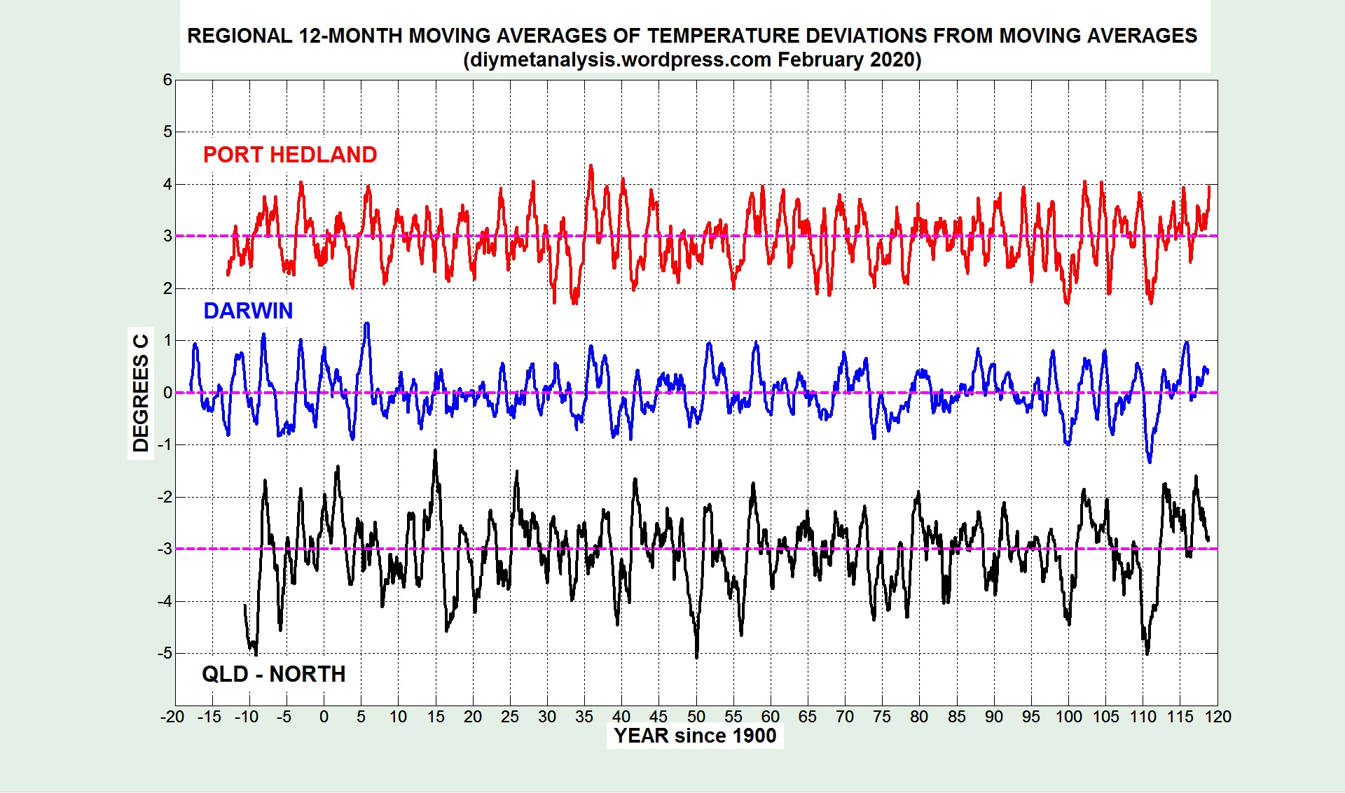
NORTH AUSTRALIA
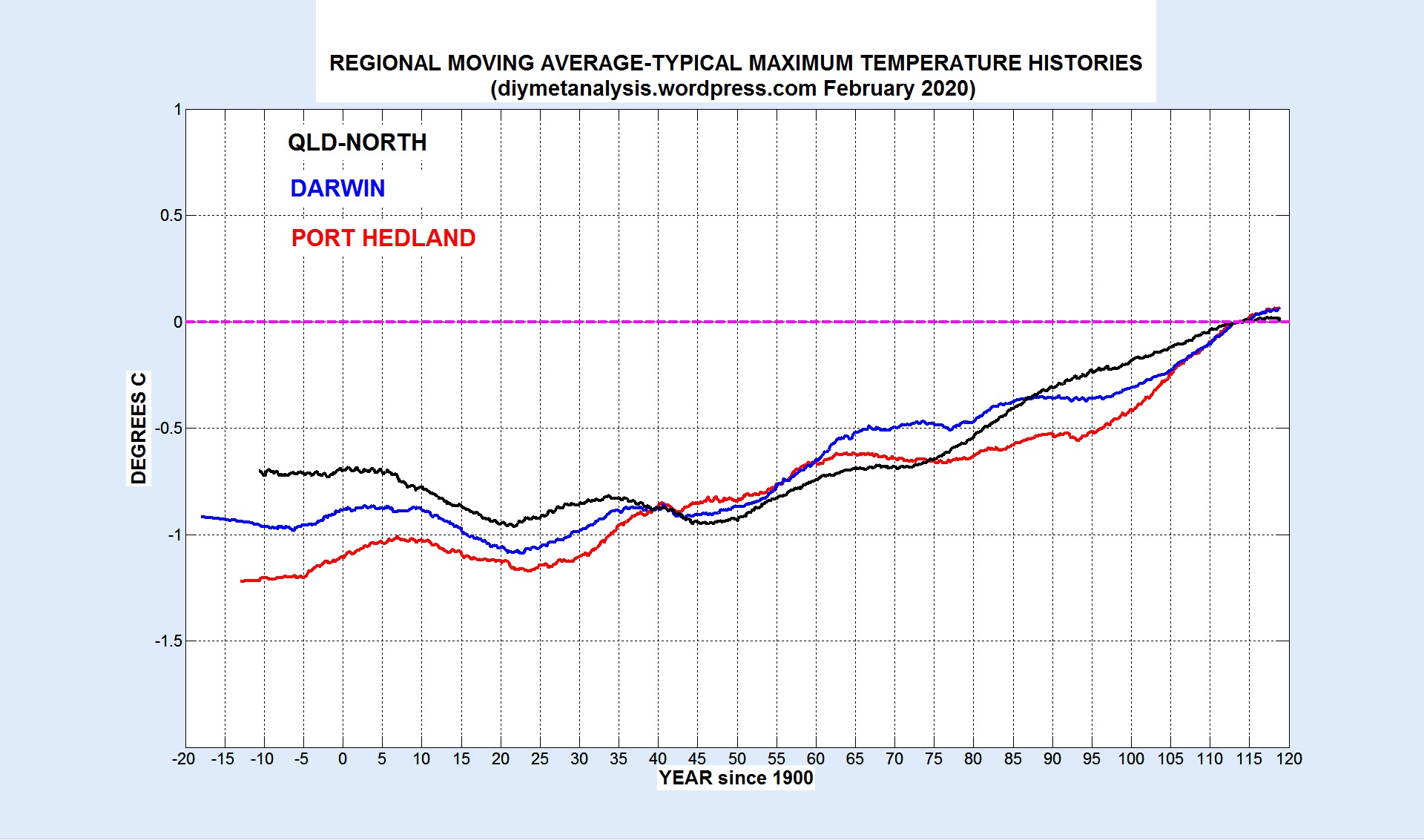
The following figure shows the moving averages of Tmax variations for the following regions in the North of Australia:
Port Hedland (Onslow to Broome, inland to Newman, Nullagine, Wittenoom)
Darwin (Broome to Burketown, inland to Halls Creek, Victoria River Downs)
Note the similarity of the temperature variations, and the East-West trend in the size of the overall change in temperature, greatest in the West, least in the East.
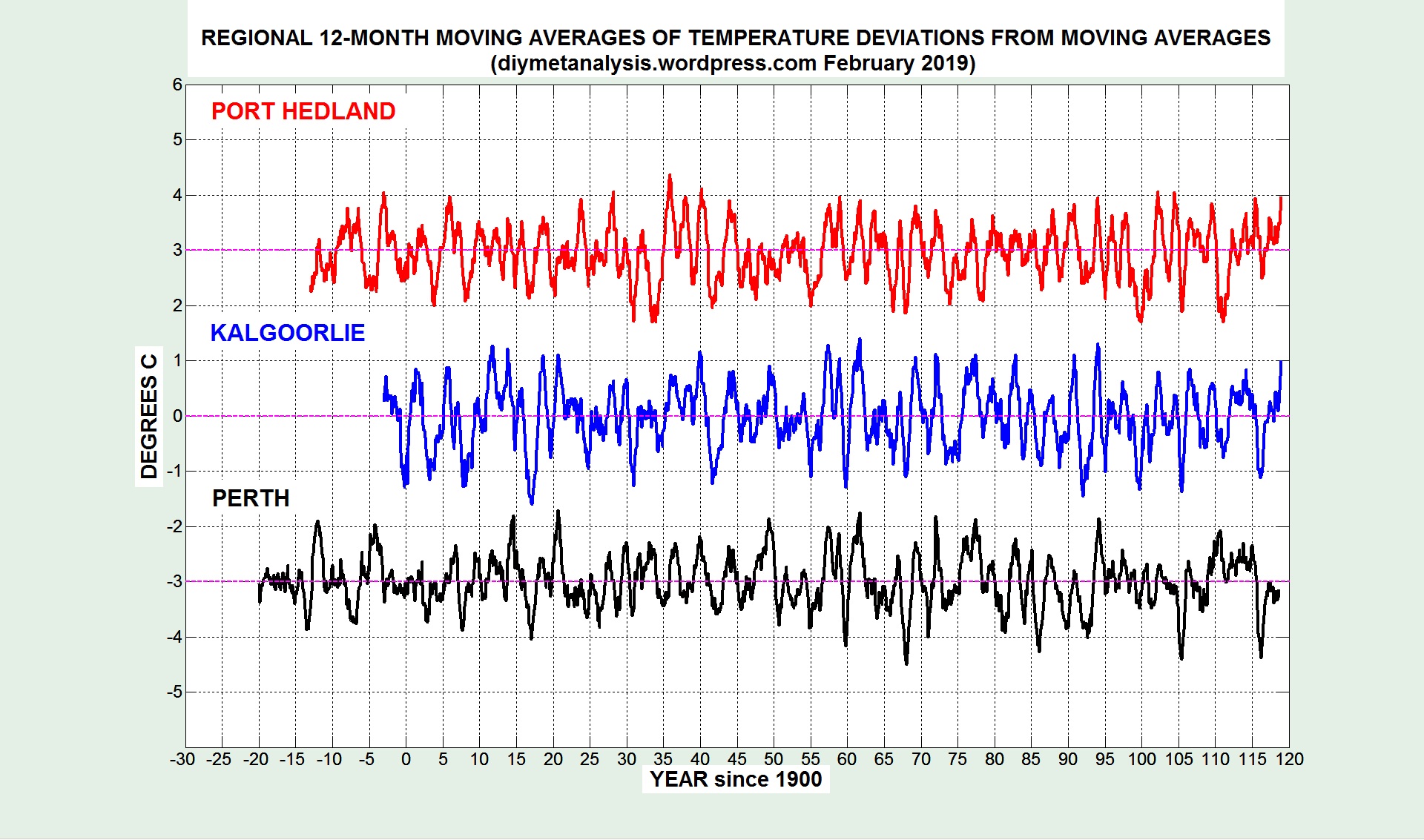
WEST AUSTRALIA
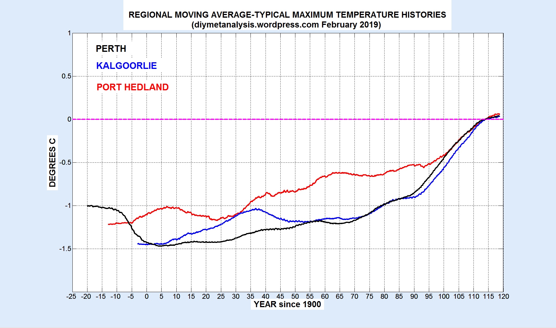
The following figure shows the moving averages from the following regions in the West of Australia:
Perth (Albany to Geraldton, inland to York, Northam, Dalwallinu, Morawa)
Note the similarity between Perth and Kalgoorlie in the South, and that they differ in shape from Port Hedland in the North, but with a similar overall change in temperature.
EAST AUSTRALIA
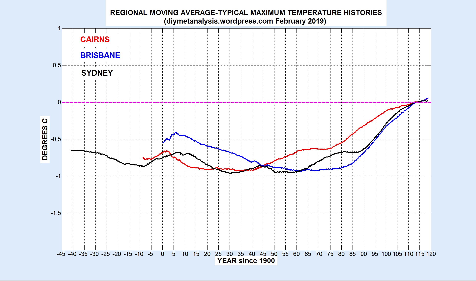
The following figure shows the moving averages from the following regions in the East of Australia:
Cairns (Cooktown to Mackay, inland to Palmerville, Charters Towers)
Brisbane (Rockhampton to Yamba)
Sydney (Newcastle to Moruya Heads)
Note the similarity of the plot above with the previous one for the West, suggesting a consistent difference in shape between North and South.
CENTRAL-EAST AUSTRALIA
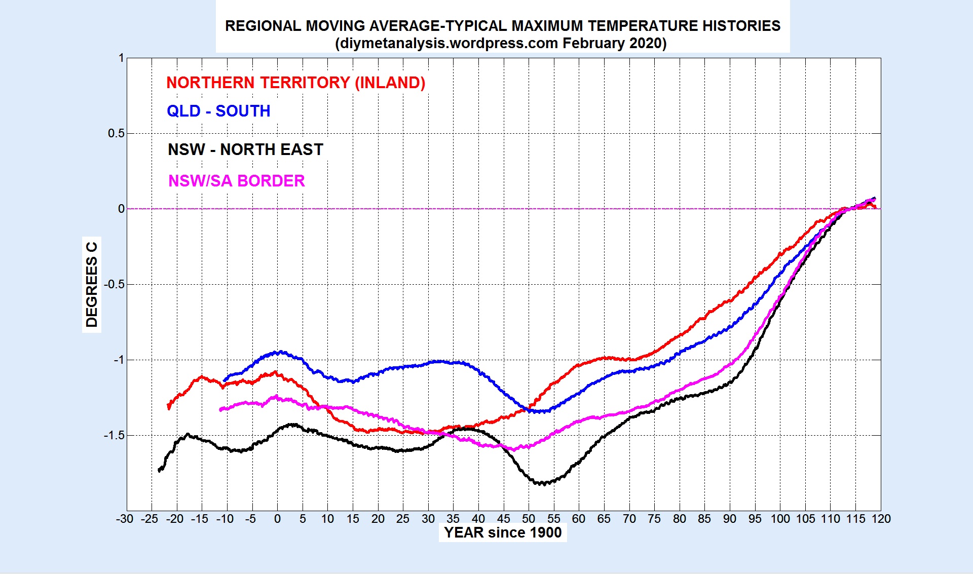
The following figure shows the moving averages from the following regions in Australia:
Northern Territory (Alice Springs, Tennant Creek, Barrow Creek, plus near neighbours in WA, QLD, NSW, SA).
QLD South (Thargomindah, Longreach, Emerald, Miles, Goondiwindi)
NSW North East (Wilcannia, Bourke, Walgett, Goondiwindi, Dubbo)
Note the temporary dips in temperature around 1950/60 in QLD-SOUTH and NSW-NE, possibly related to relatively high rainfall in those areas in that period.
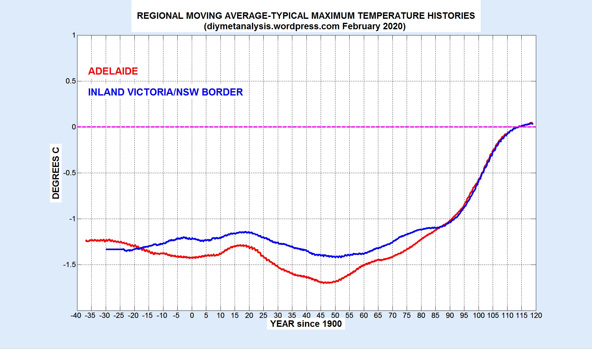
ADELAIDE and INLAND VICTORIA/NSW BORDER
The following figure shows the moving averages from the following regions in South-East Australia:
Inland Victoria/NSW border (Swan Hill, Hay, Wagga Wagga, Albury, Boort)
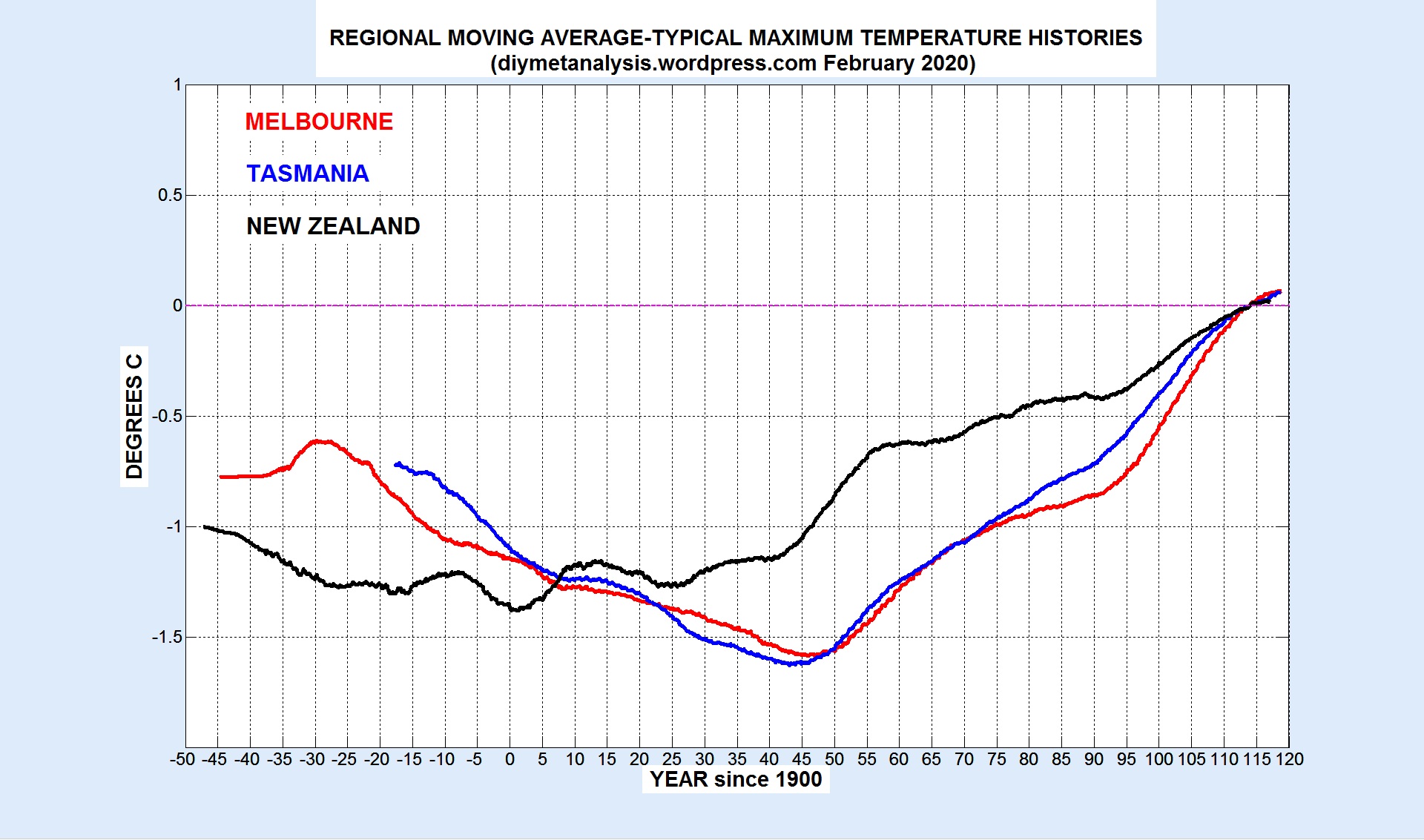
SOUTH-EAST AUSTRALIA and NEW ZEALAND
The following figure shows the moving averages from the following regions in Southern Australia and New Zealand:
Melbourne (plus Cape Otway, Wilsons Prom, Sale)
Tasmania (the whole island)
New Zealand (excluding the far North and South)
Note the strong similarity between Melbourne and Tasmania, both of which have the mid 20th century dips seen in the previous examples further North.
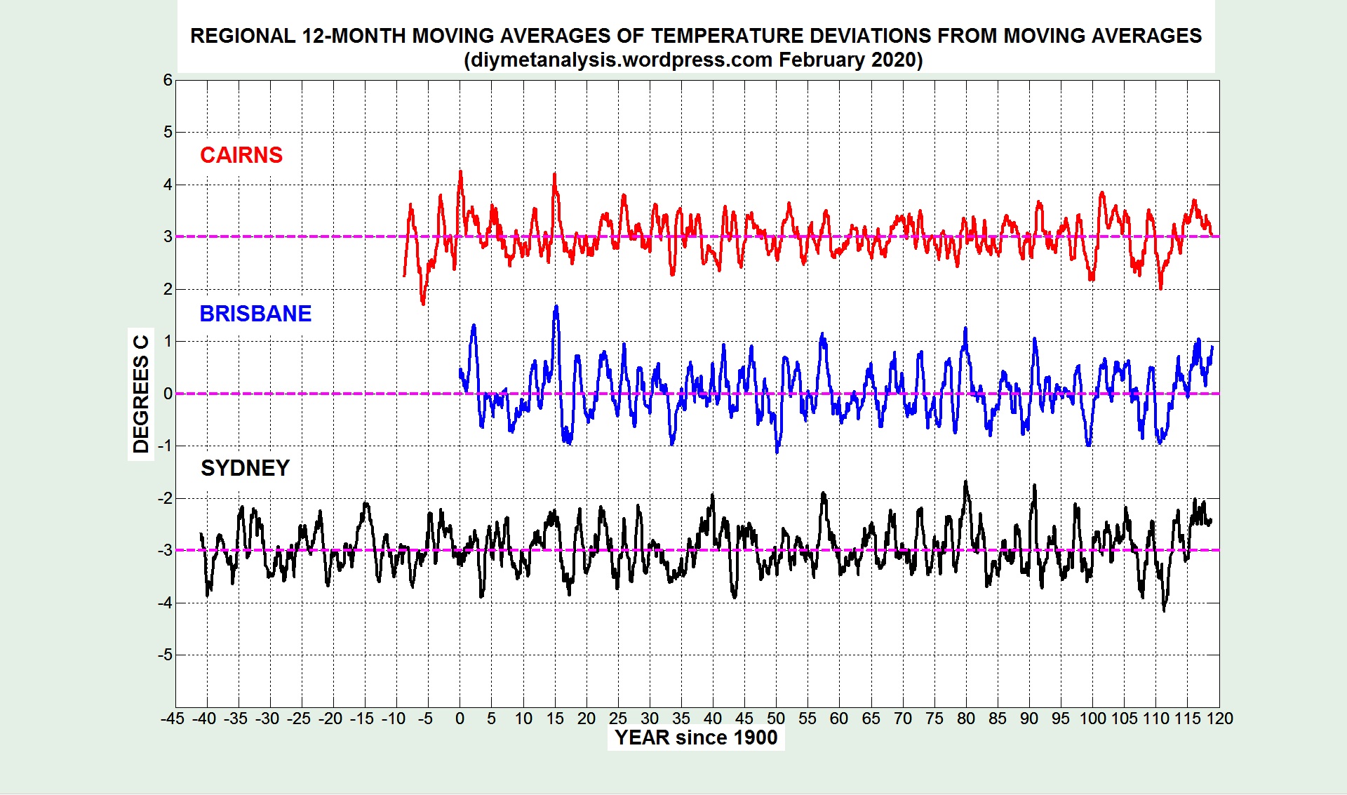
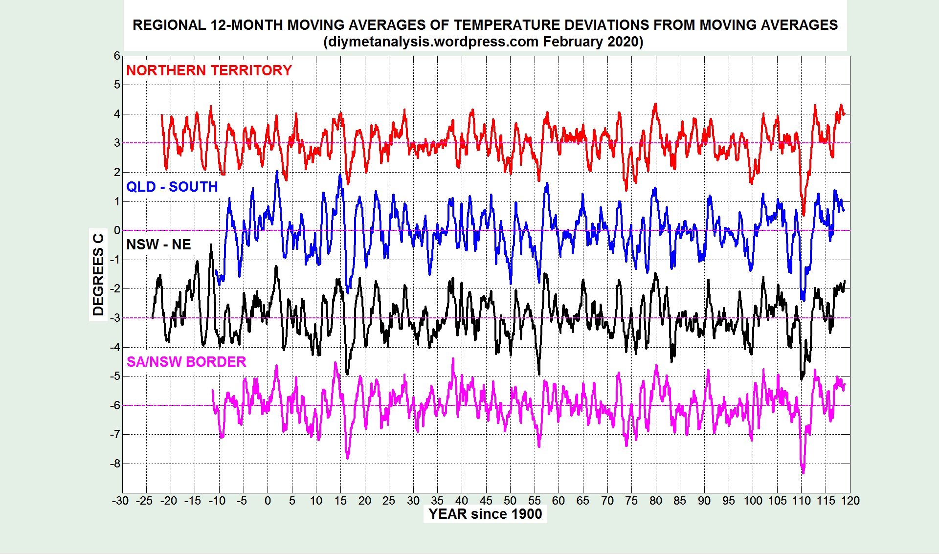
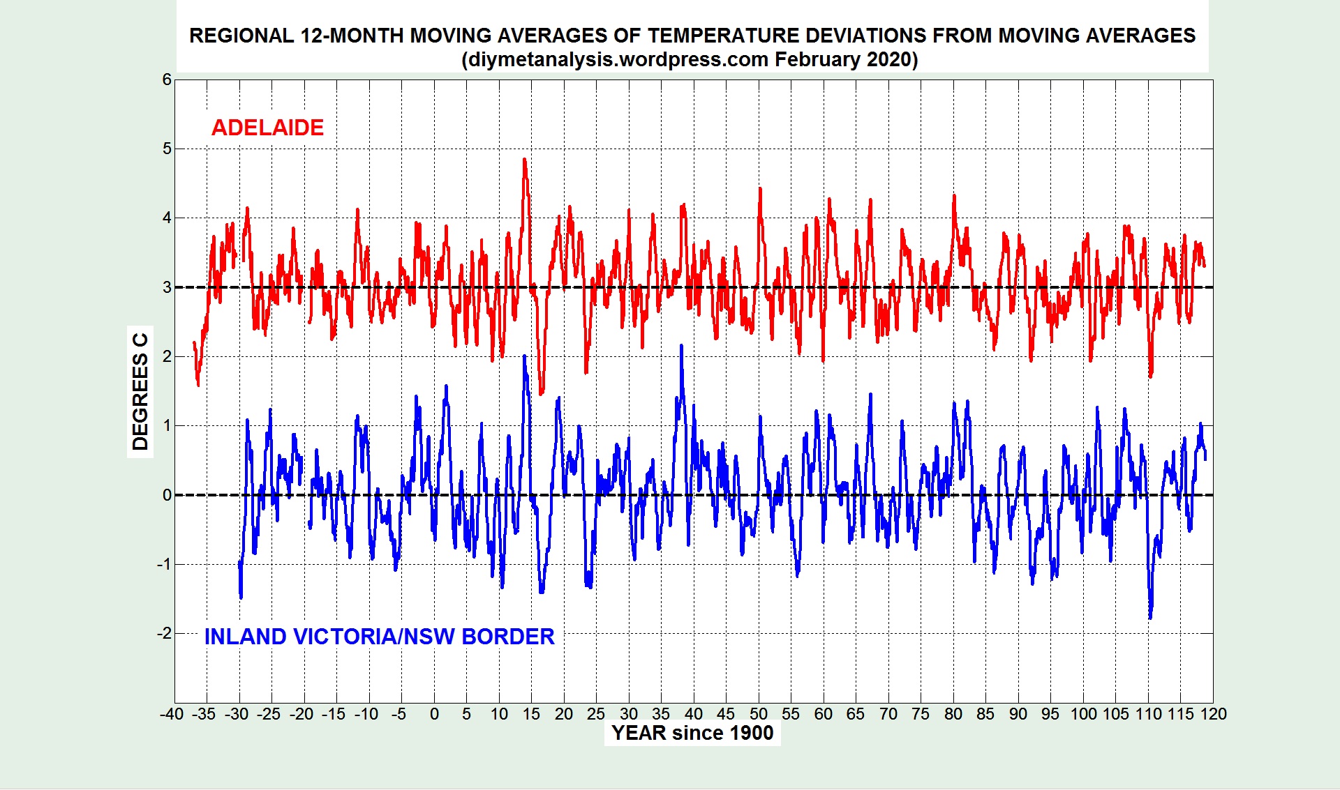
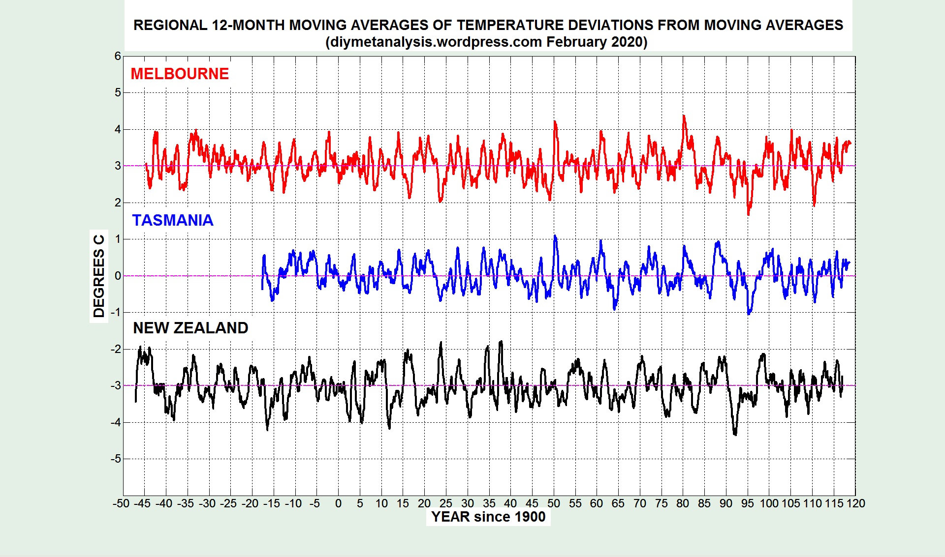
TEMPERATURE DEVIATIONS
The following set of plots show the associated temperature deviations, as 12-month moving averages, from the moving averages shown above. In some cases early peaks, when added to the moving average, give temperatures similar to those of recent years, but note the statistical fact that there is more data to choose from in the early “cool” years, compared with the recent “warm” years.
SAMPLE STATION ANALYSIS
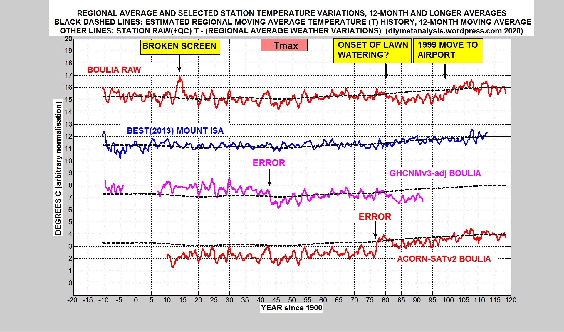
The following plot shows some of the analysis performed for one temperature record, from the town of Boulia in inland Queensland. The QLD-NORTH temperature deviations shown above were subtracted from various versions of the data for Boulia.
The raw data in red maintains close alignment with the regional average, apart from an anomalous warm period around 1914, probably due to a broken screen, and an anomalous cool period starting around 1980, probably caused by the onset of watering of the lawn on which the thermometers were sited, and ending in 1999 when the station moved to the airport. The metadata for these changes can be found in TOROK-1997 and ACORN-SAT documentation, see the DATA page above for links.
Berkeley Earth (BEST) (2013) data in blue for nearby Mount Isa maintains close alignment with the regional average throughout. GHCNMv3-adjusted appears to have been fooled by a transient warming around 1940. That 1940 transient was correctly ignored by ACORN-SATv2, but it appears that the onset of lawn watering around 1980 is badly over-corrected in that version of events, leading to over-cooling of early data by around 1C.
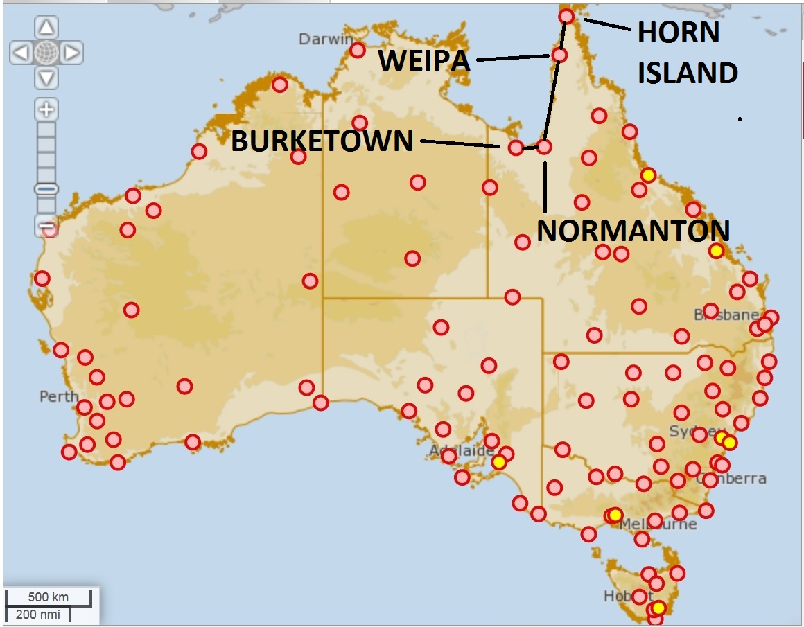
Map above: The ACORN-SATv2 stations featured in this post
SCOPE
This post documents ACORN-SATv2 validation test results for the Gulf of Carpentaria coast of Queensland, featuring the following stations, with BoM ids in brackets:
BURKETOWN (29077)
NORMANTON (29063)
WEIPA (27045)
HORN ISLAND (27058)
See the ACORN-SAT page above for information about the data being tested, and the test procedure.
See the BEST page above for information about Berkeley Earth, the data used here as a “reference series”, in this region for the following location: 15.27 S, 142.50 E.
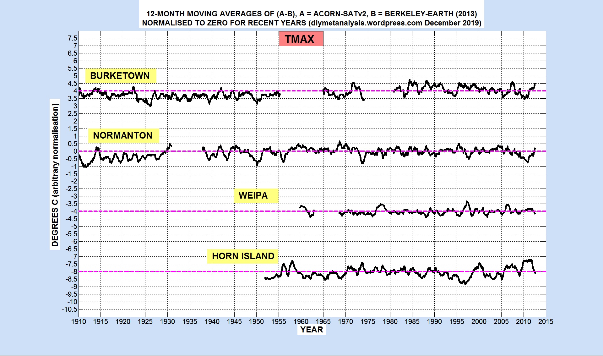
ACORN-SATv2 versus BEST, Tmax
The following figure shows ACORN – BEST, as a 12-month moving average, normalised to zero for recent years:
The figure above suggests that ACORN-SATv2 is anomalously cool in the early to mid 20th century for Burketown and Normanton. Analysis plots for these stations may be added for these stations at a later date.
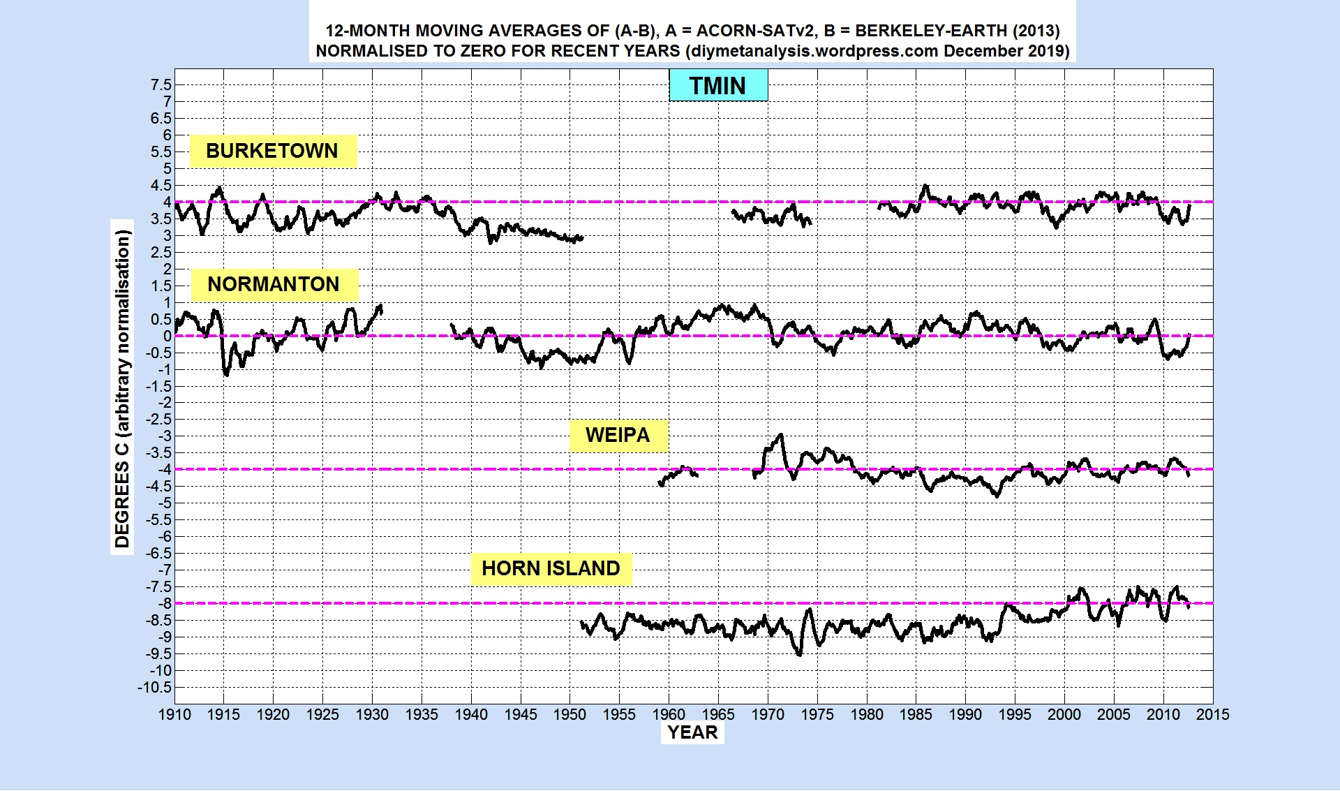
ACORN-SATv2 versus BEST, Tmin
The following figure shows ACORN – BEST, as a 12-month moving average, normalised to zero for recent years:
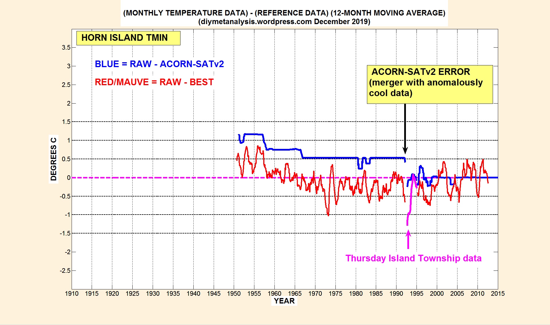
The figure above suggests that ACORN-SATv2 data for Horn Island is anomalously cool throughout the 20th century, the reason for this is identified in the following analysis plot.
Analysis of Horn Island Tmin
The following figure shows 12-month moving averages of differences between monthly data as follows:
Blue: (RAW – ACORN). This indicates the adjustments made in ACORN-SATv2
Red: (RAW – BEST). This indicates the variation of non-climatic influences
The ACORN-SATv2 error is the difference between the blue and red curves, the positive difference before 1992 indicating excessive cooling of raw data. The red data in the figure above shows that no adjustment (at the level of annual averages) is necessary between 1970 and 2005.
Preliminary analysis suggests that the ACORN-SATv2 error in 1992 arose from the very small number (2) of reference stations used to derive the size of it, one of which has anomalous temperature changes around 1992. This post may be updated later with more details.
This posts documents validation test results for ACORN-SATv2 stations in Tasmania, for both Tmax and Tmin. The stations and their BoM ids are as follows:
LOW HEAD (91293)
LAUNCESTON AIRPORT (91311)
LARAPUNA (92045)
CAPE BRUNY (94010)
HOBART (94029)
GROVE (94220)
BUTLERS GORGE (96003)
Background information for ACORN-SAT, and for the validation procedure, can be found via the ACORN-SAT page above, which also gives details of how the daily data was converted to monthly averages.
Berkeley-Earth (BEST) data for the country of Tasmania was used as a “reference series”, see the BEST page above for links to the data, and a discussion of how well it is suited to this purpose.
ACORN-SATv2 versus BEST, Tmax
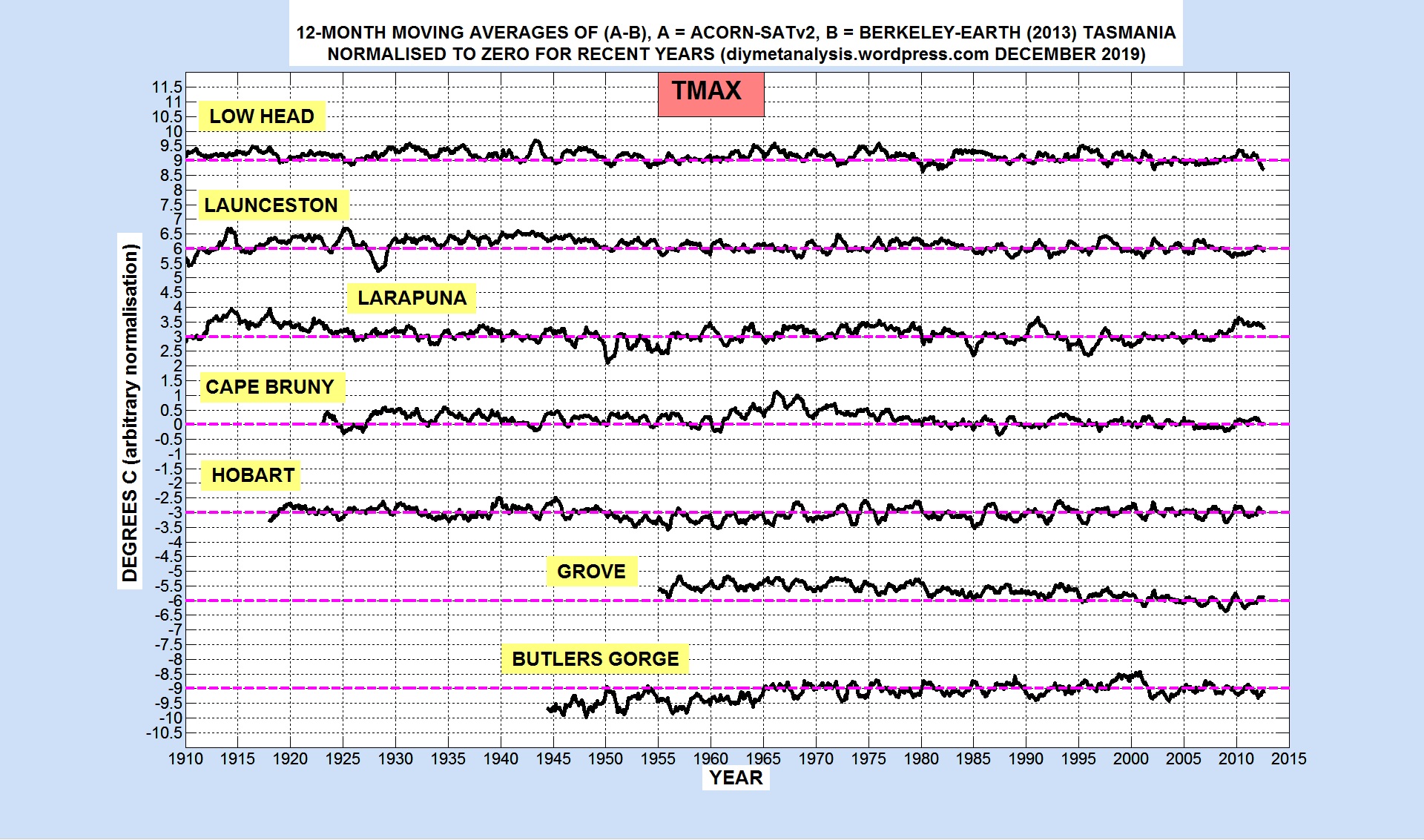
The following figure shows, for each station listed above, for Tmax data, 12-month moving averages of (ACORN – BEST), normalised to zero for recent years:
Some of the ACORN-SAT Tmax station data does not have trend consistency between stations, see in particular the difference between Grove and Butlers Gorge, it therefore fails at least this part of the validation procedure. Analysis may be added later to this post to identify the adjustments that are invalid.
ACORN-SATv2 versus BEST, Tmin
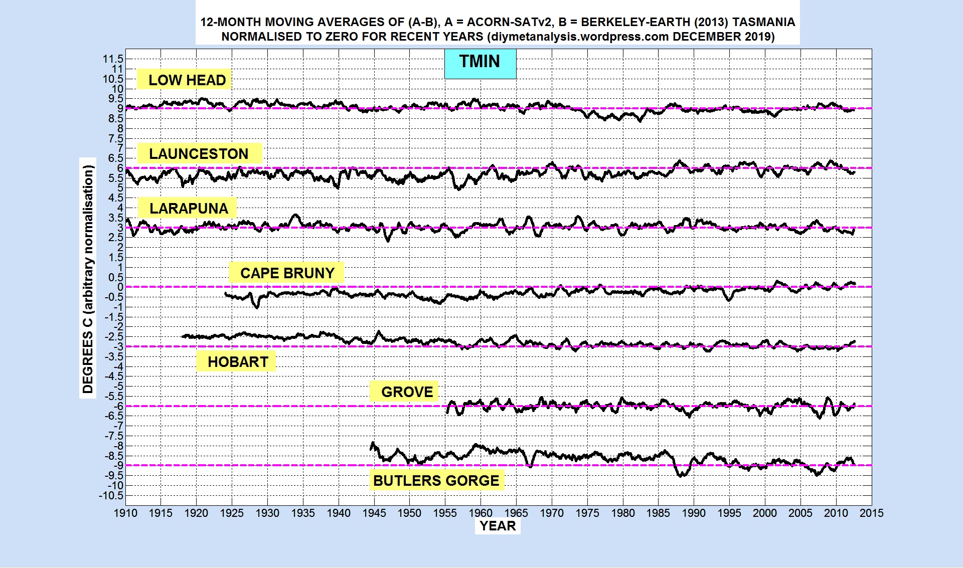
The following figure shows, for each station listed above, for Tmin data, 12-month moving averages of (ACORN – BEST), normalised to zero for recent years:
Some of the ACORN-SAT Tmin station data does not have trend consistency between stations, see in particular the difference between Butlers Gorge and Cape Bruny, it therefore fails at least this part of the validation procedure. Analysis may be added later to this post to identify the adjustments that are invalid.
End of Post (more analysis detail may be added later)
This post gives validation test results for ACORN-SATv2 stations in the vicinity of Adelaide, which are as follows, with BoM ids:
Adelaide Kent Town (23090)
Snowtown (21133)
Nuriootpa (23373)
Cape Borda (22823)
See the ACORN-SAT page above for background information, details of the validations tests, and an outline of how they were done.
Both Tmax and Tmin results are obtained by using Berkeley Earth BEST (2013) data for the city of Adelaide, acting as “reference series”. See the BEST page above for the reasoning behind this choice of reference series. Note that there is currently no independent validation of the BEST data for Adelaide.
ACORN-SATv2 vs BEST
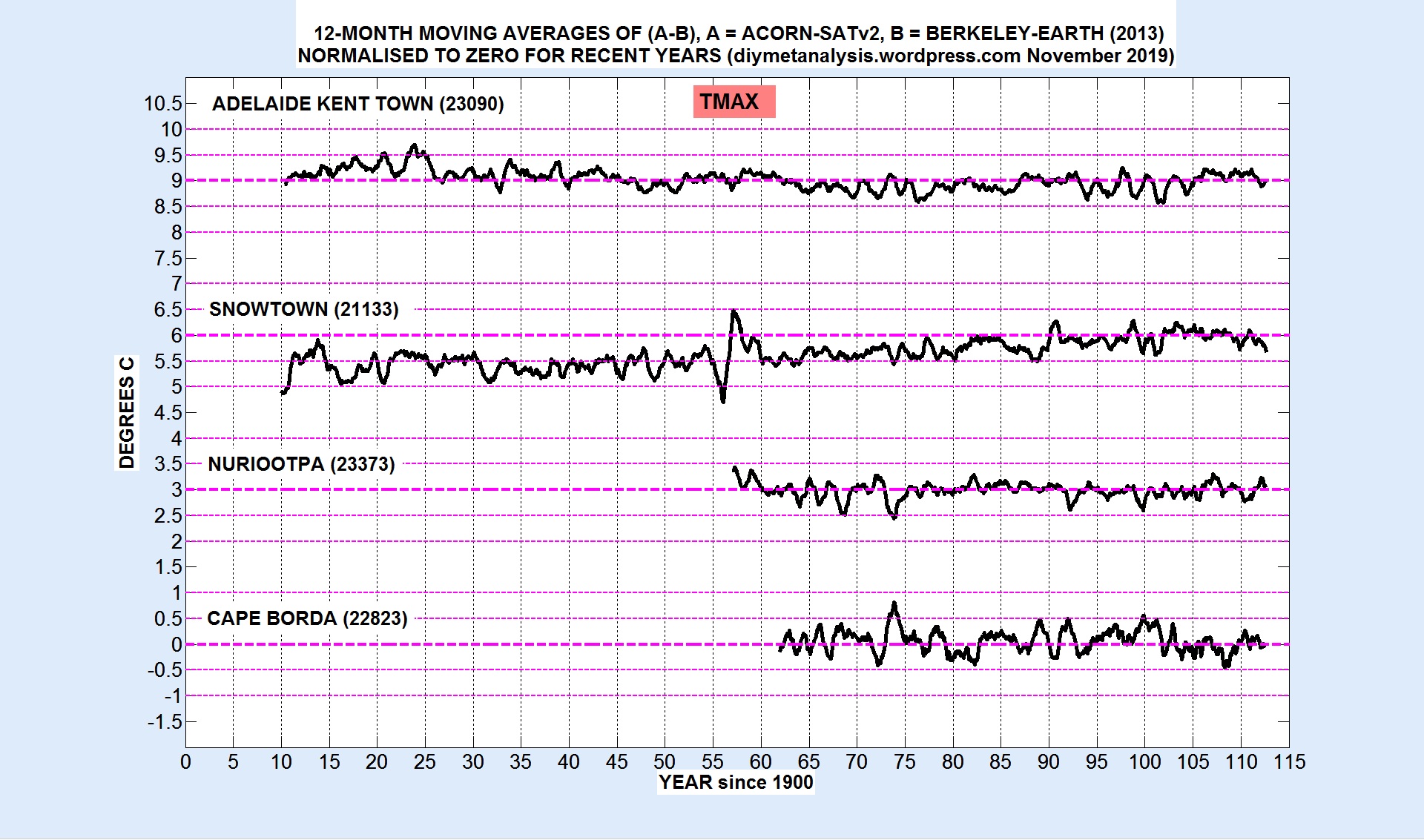
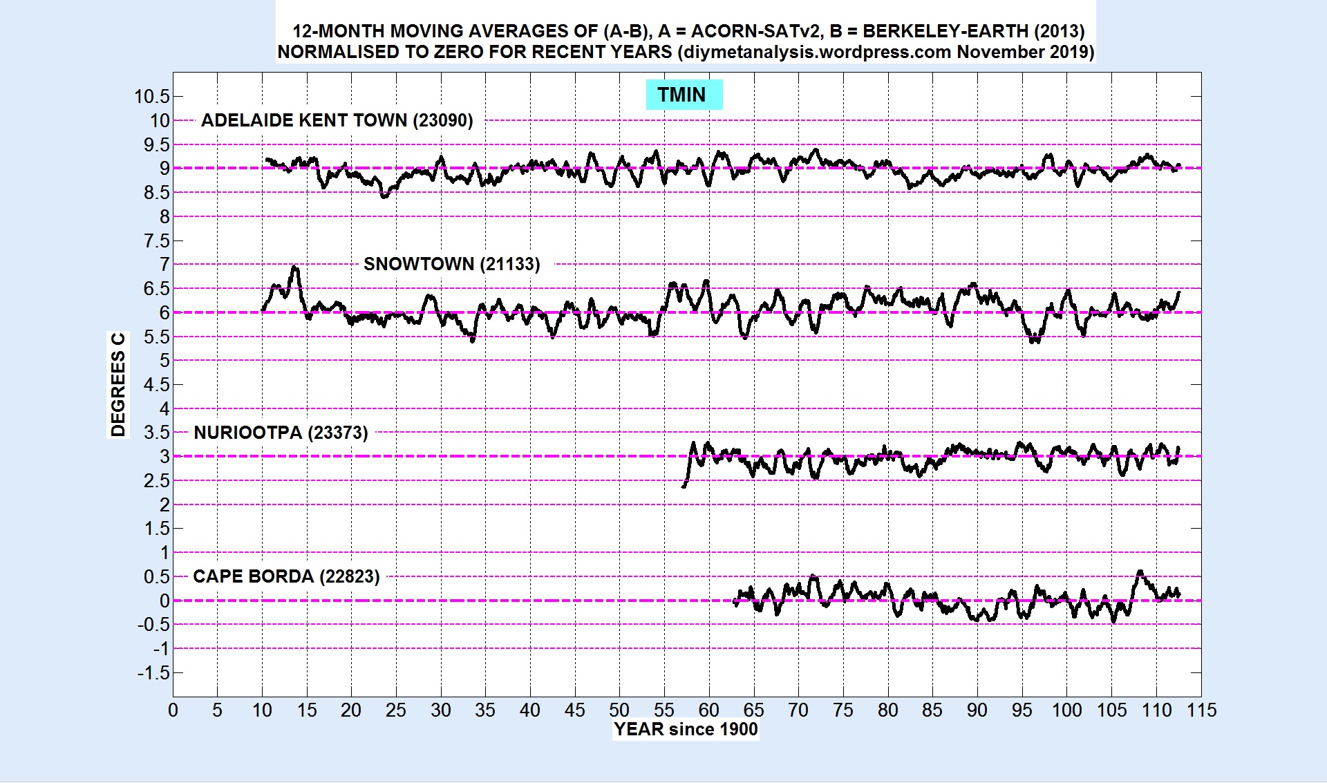
The following two figures (Tmax and Tmin) act as surveillance test results, indicating stations with significant errors. Plotting the stations together allows checking of the internal self consistency of ACORN-SAT, these stations are close together, at a similar distance from the ocean, so should have very similar climatologies.
The following figures show 12-month moving averages of ACORN – BEST:
The only substantial error is in ACORN-SATv2 Snowtown Tmax, which is over-cooled in early years, and is inconsistent with its neighbours.
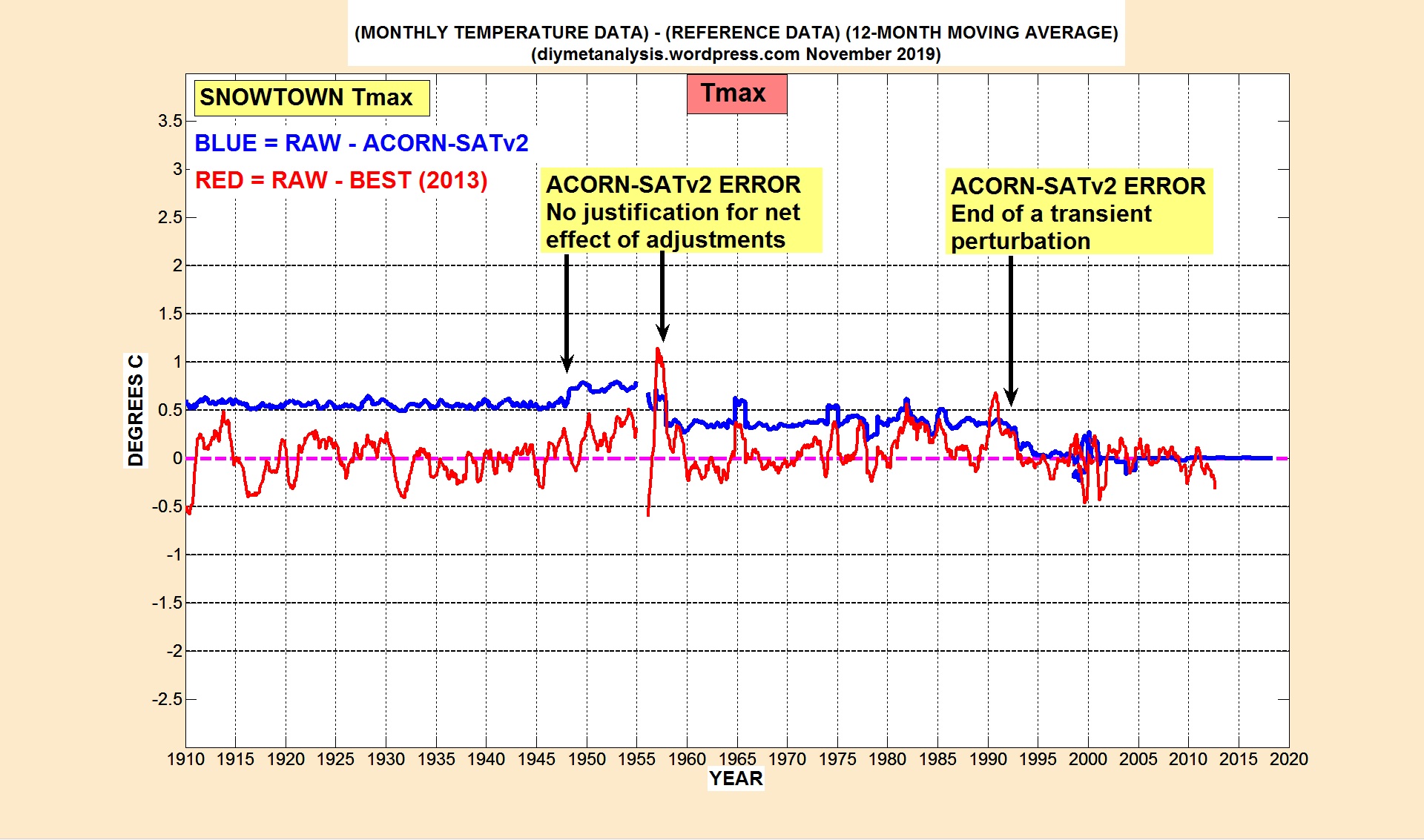
SNOWTOWN Tmax Analysis
The following figure allows us to compare ACORN-SATv2 adjustments (blue) with changes in raw data (red):
The figure above indicates that the raw data doesn’t really need any overall end-to-end adjustment. The spurious ACORN-SATv2 adjustments appear to arise from the tunnel-vision of the procedure, mistaking transient changes for persistent ones.
This post gives validation test results for ACORN-SATv2 monthly average minimum temperatures (Tmin) at the stations near Albury, which in order of presentation, with BoM ids, are:
Deniliquin (74258)
Rutherglen (82039)
Wagga Wagga (72150)
Kerang (80023)
METHODOLOGY
Berkeley Earth (BEST) Tmin data for the nearby town of Albury are used as a “reference series” to test for inhomogeneities, consistency between near neighbours, and validity of the station adjustments relative to changes in the raw data. See the BEST page above for a discussion of the validity of BEST data as a reference series, both in general, and for the specific case of Albury.
DENILIQUIN
The following figure shows the validity of the best of this cluster of stations:
The blue data show the size of the adjustments made to raw data, plotted so as to indicate how ACORN-SAT has decided the raw data (in red) has changed as a result of non-climatic influences. The figure above shows that the ACORN-SAT “rectangular” model of non-climatic influences works well for this example. A later plot shows very close agreement between ACORN-SATv2 (Deniliquin) and BEST (Albury) Tmin data.
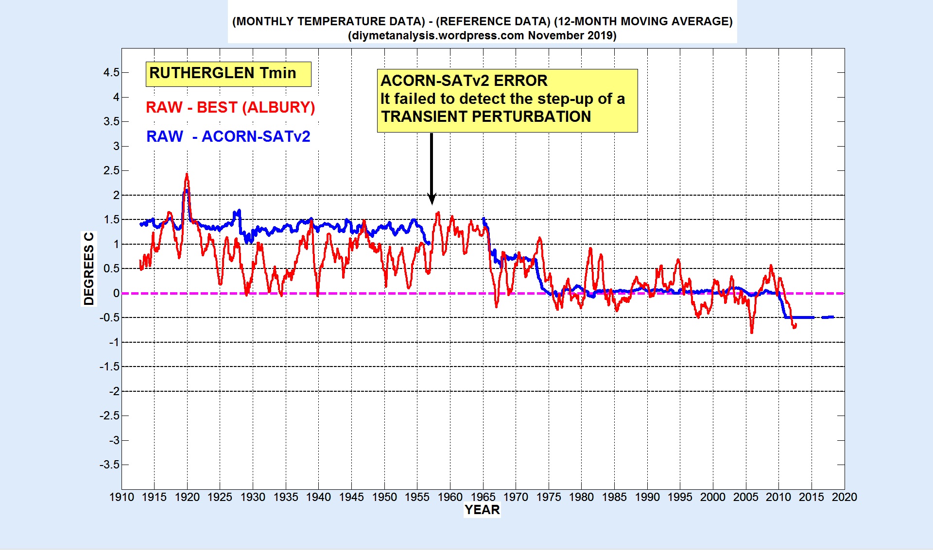
RUTHERGLEN
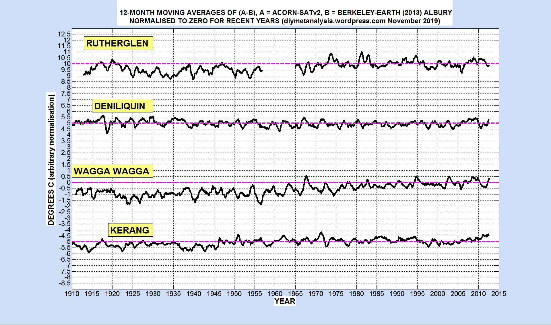
The following figure reveals an error in ACORN-SATv2 for Rutherglen, the onset of a transient temperature change around 1967 was not detected, leading to excessive cooling of all data before the perturbation (see a later figure for the size of the excessive cooling):
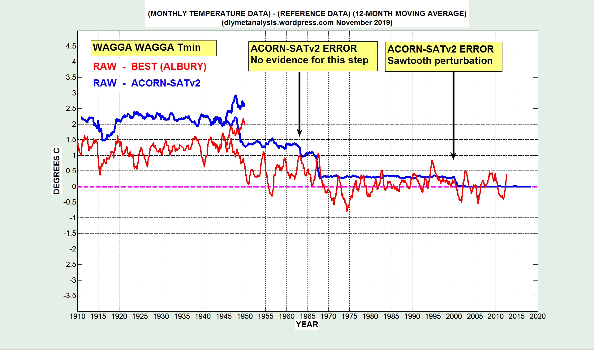
WAGGA WAGGA
The following figure reveals two errors in ACORN-SATv2 for Wagga Wagga, leading to excessive cooling of most 20th century temperatures (see a later figure for the size of the excessive cooling):
KERANG
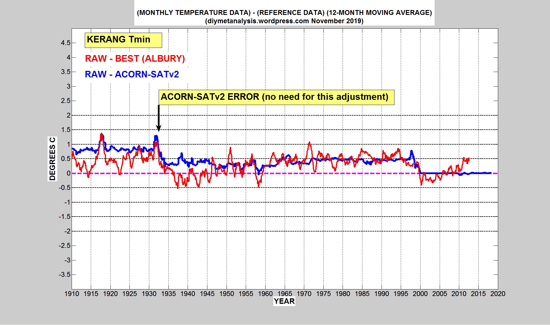
The following figure reveals an errors in ACORN-SATv2 for Kerang, leading to excessive cooling of early data (see a later figure for the size of the excessive cooling):
ERROR SUMMARY
Apart from the case of Deniliquin, ACORN-SATv2 Tmin adjustments in this region have been found to lead to excessive cooling of the past, from a combination of missed adjustments, erroneous adjustments and slow drifts away from the “rectangular” assumption for temperature changes. The following figure summarises the errors:
VALIDITY OF BEST ALBURY Tmin
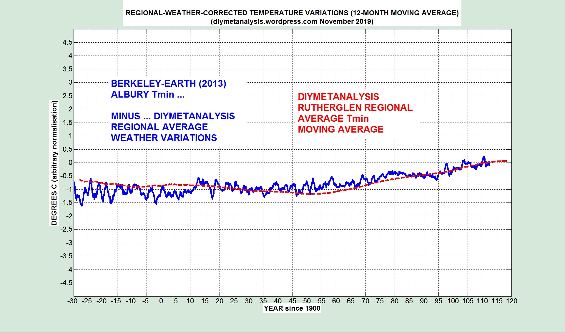
The following figure shows a comparison between BEST Albury Tmin data and the regional average of this website, as posted in EXAMPLE 02: Rutherglen Tmin:
There is a discrepancy around 1910, which should not impact on the test results for ACORN-SAT.
This post gives a reconstruction of monthly average maximum temperatures (Tmax) back to 1878 in the central part of Australia, roughly centred on the town of Alice Springs, which has the oldest data in the region, and shown as the red rectangle on the above map. In addition, data from Darwin Post Office was used to help with the early period.
Methodology: The standard methodology of this website was used. Data was averaged democratically across the region, with exclusion of periods deemed to be invalid due to non-climatic influences, such as station moves and equipment changes.
Data Sources: All temperature data was downloaded from the BoM Climate Data Online website, in November 2019 for the stations that are still active. Metadata sources used were TOROK (1997) and the ACORN-SATv2 online station catalogue, see the DATA PAGE above for links.
RESULTS
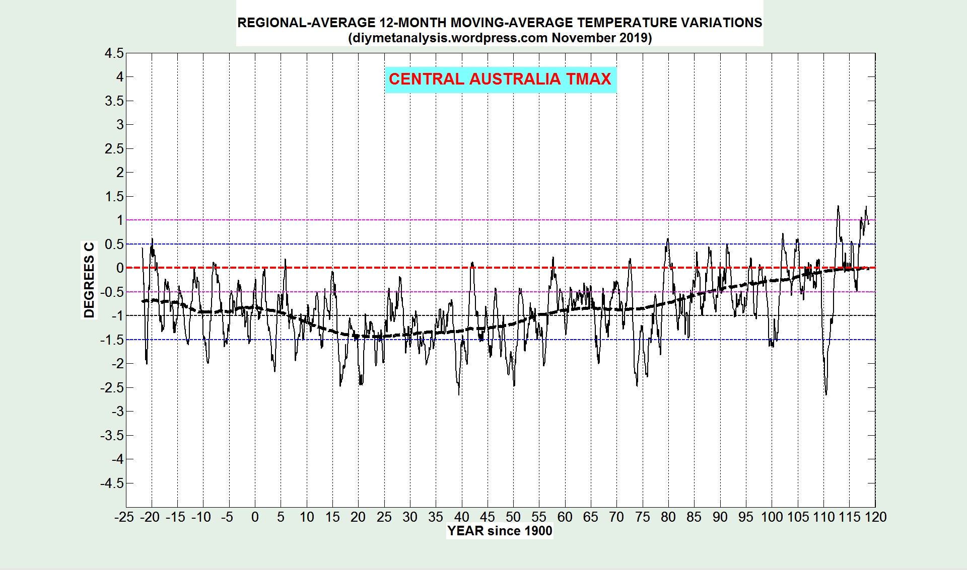
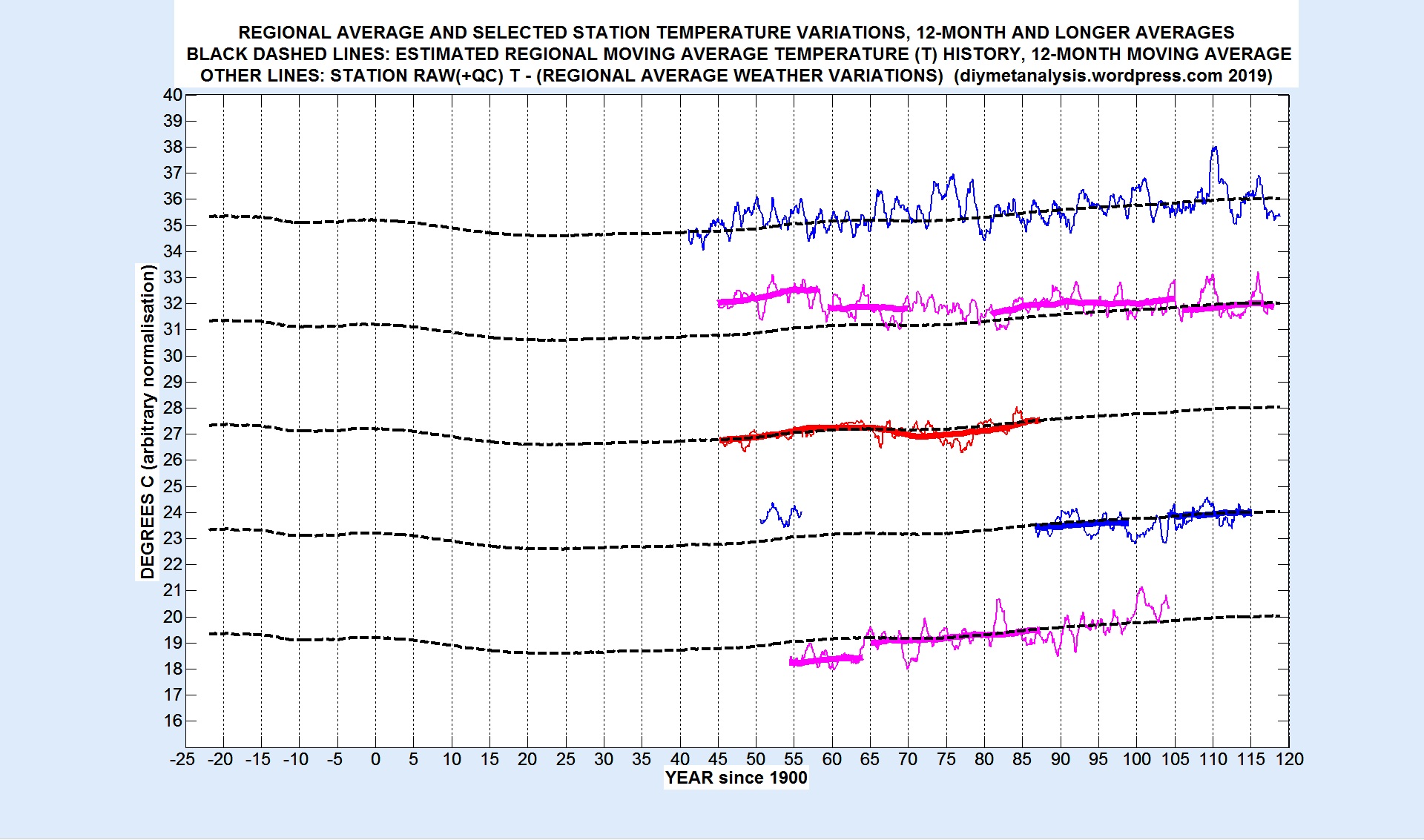
The following figure shows the 12-month moving averages of the regional moving average (MAV, the dashed line) and the sum of MAV and the regional average temperature deviations from the MAV.
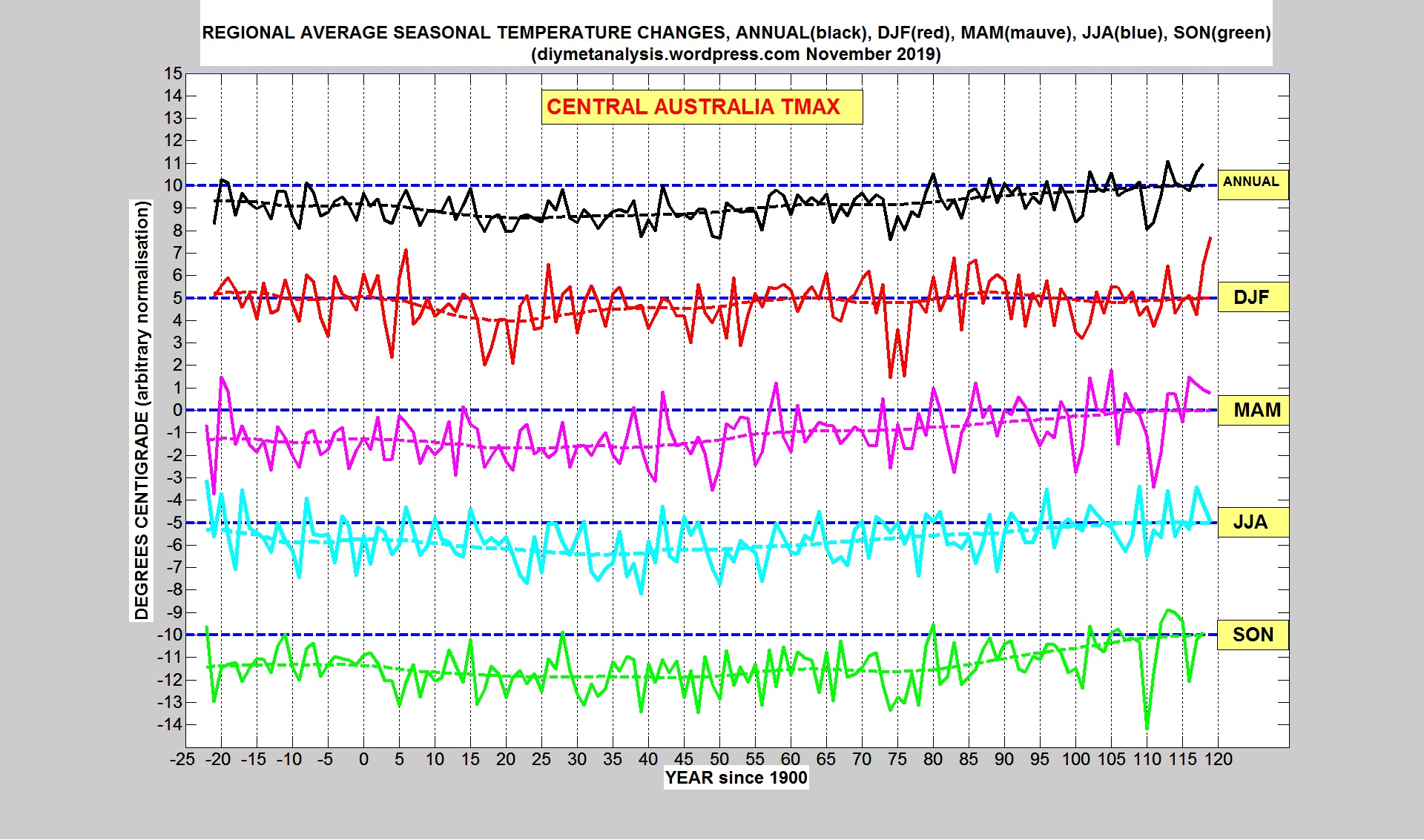
The seasonal variations of Tmax are shown in the following figure:
VALIDATION
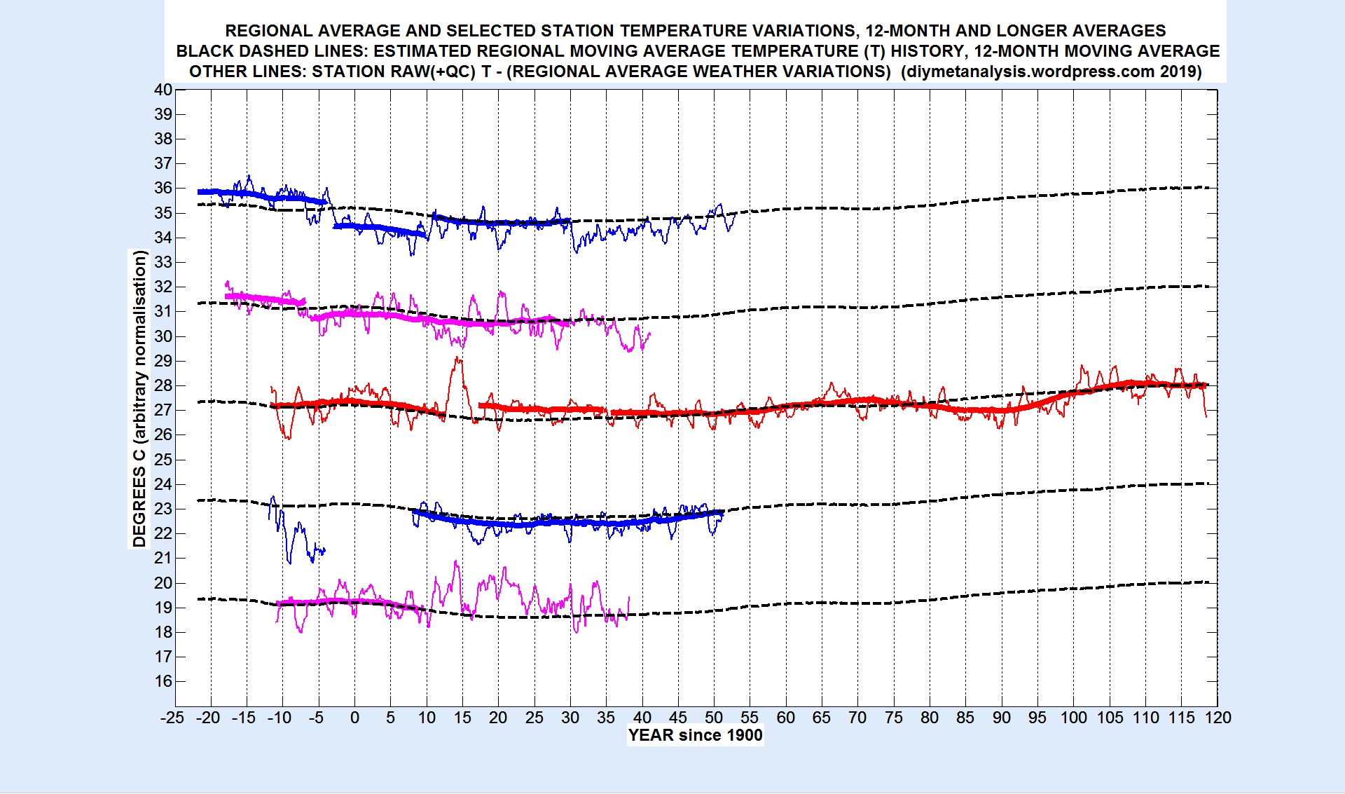
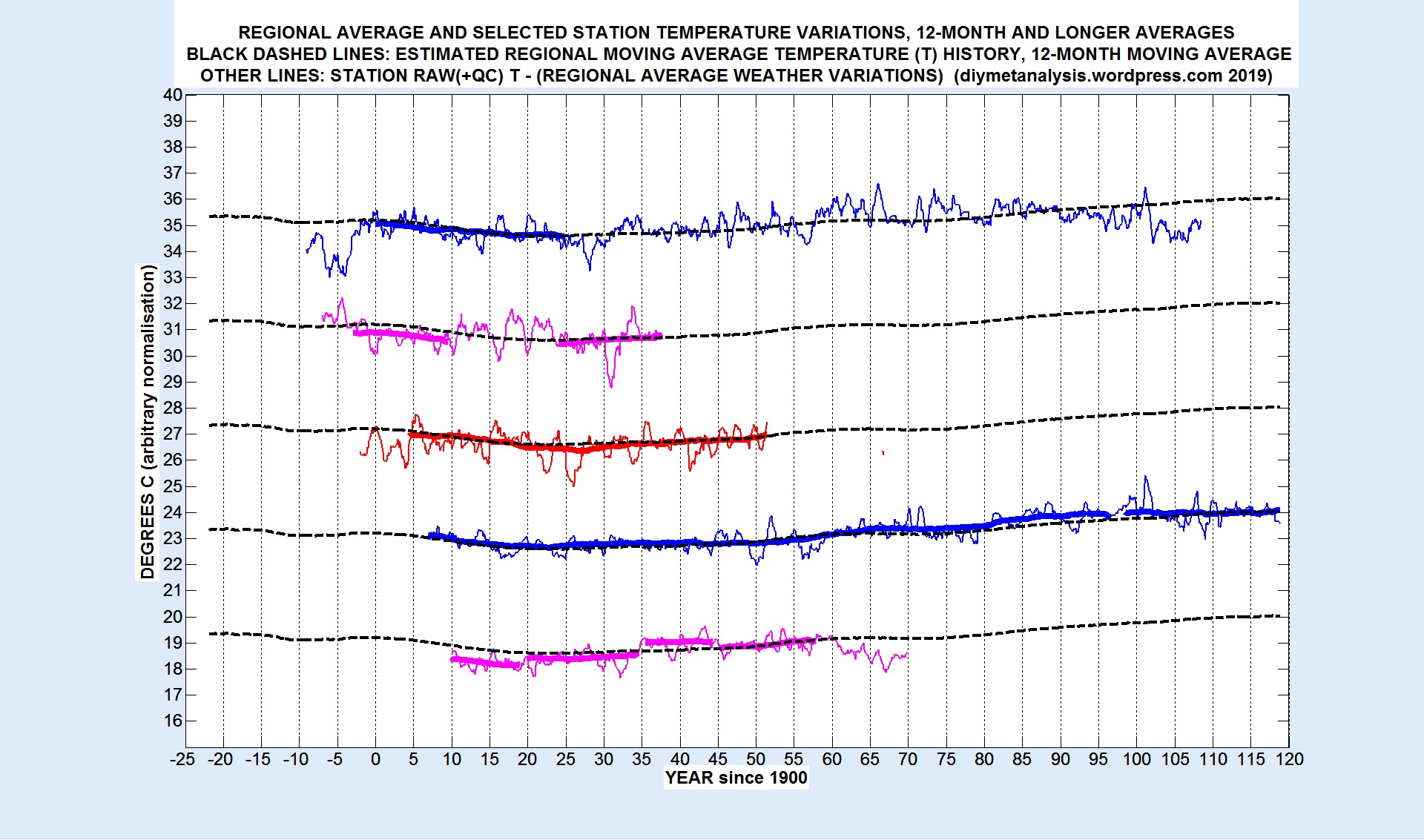
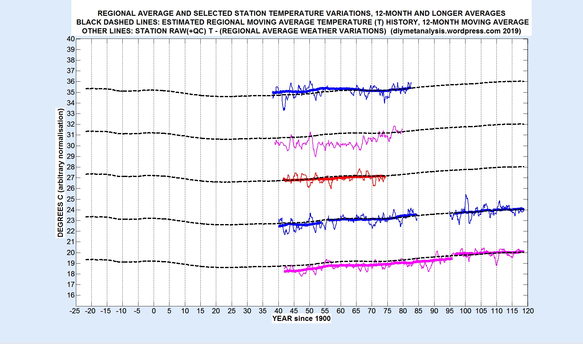
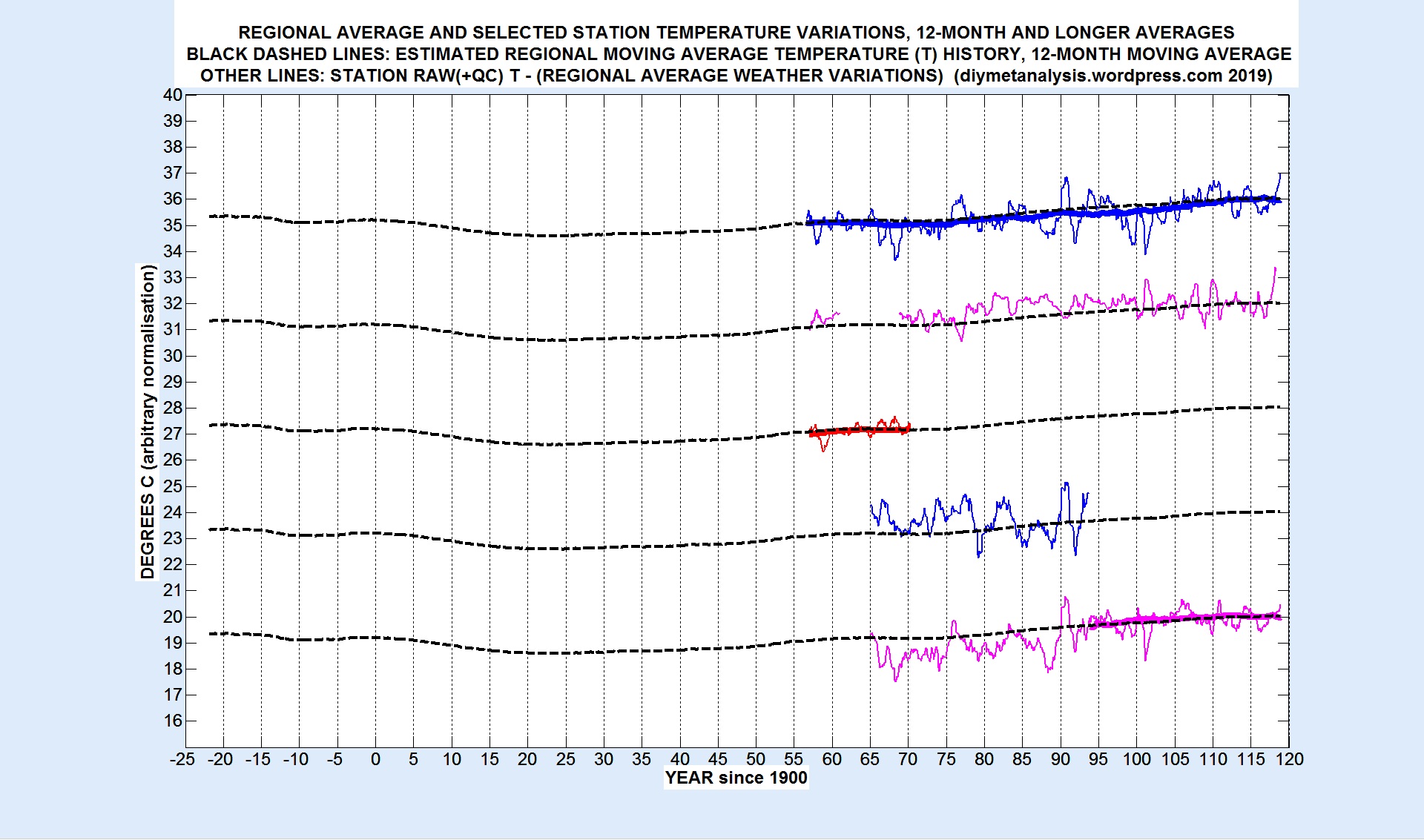
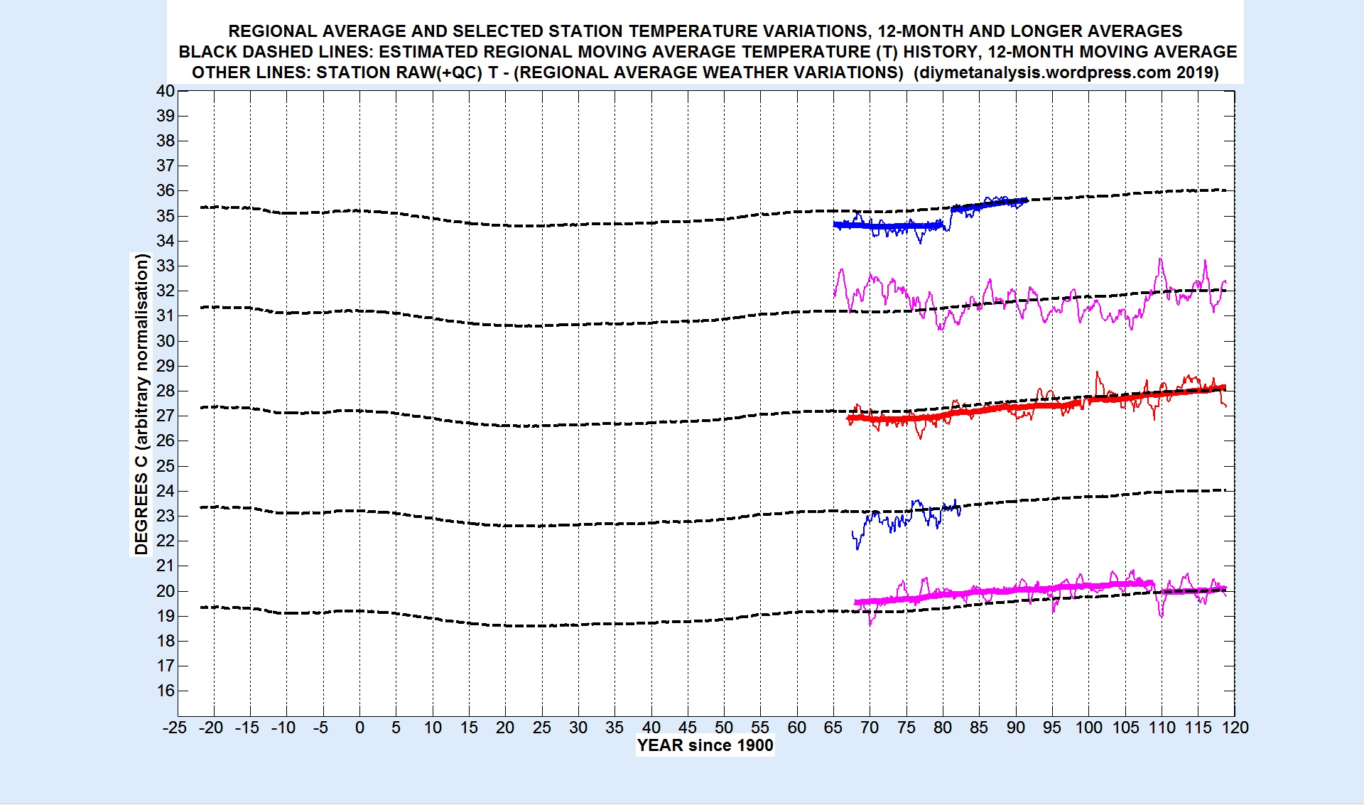
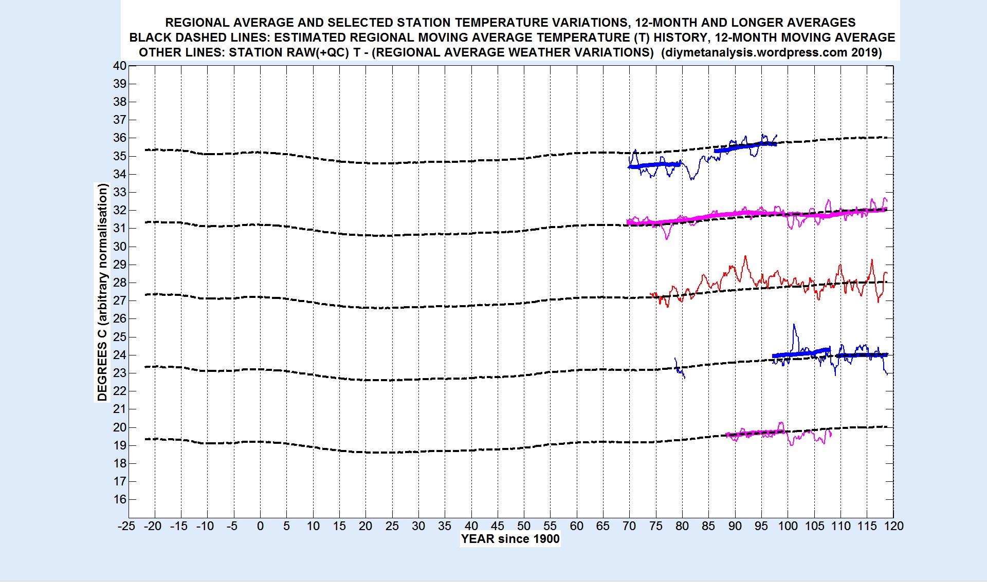
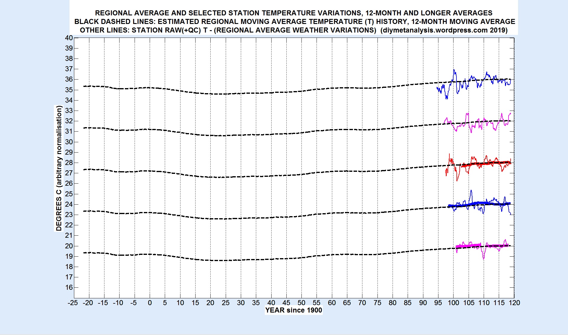
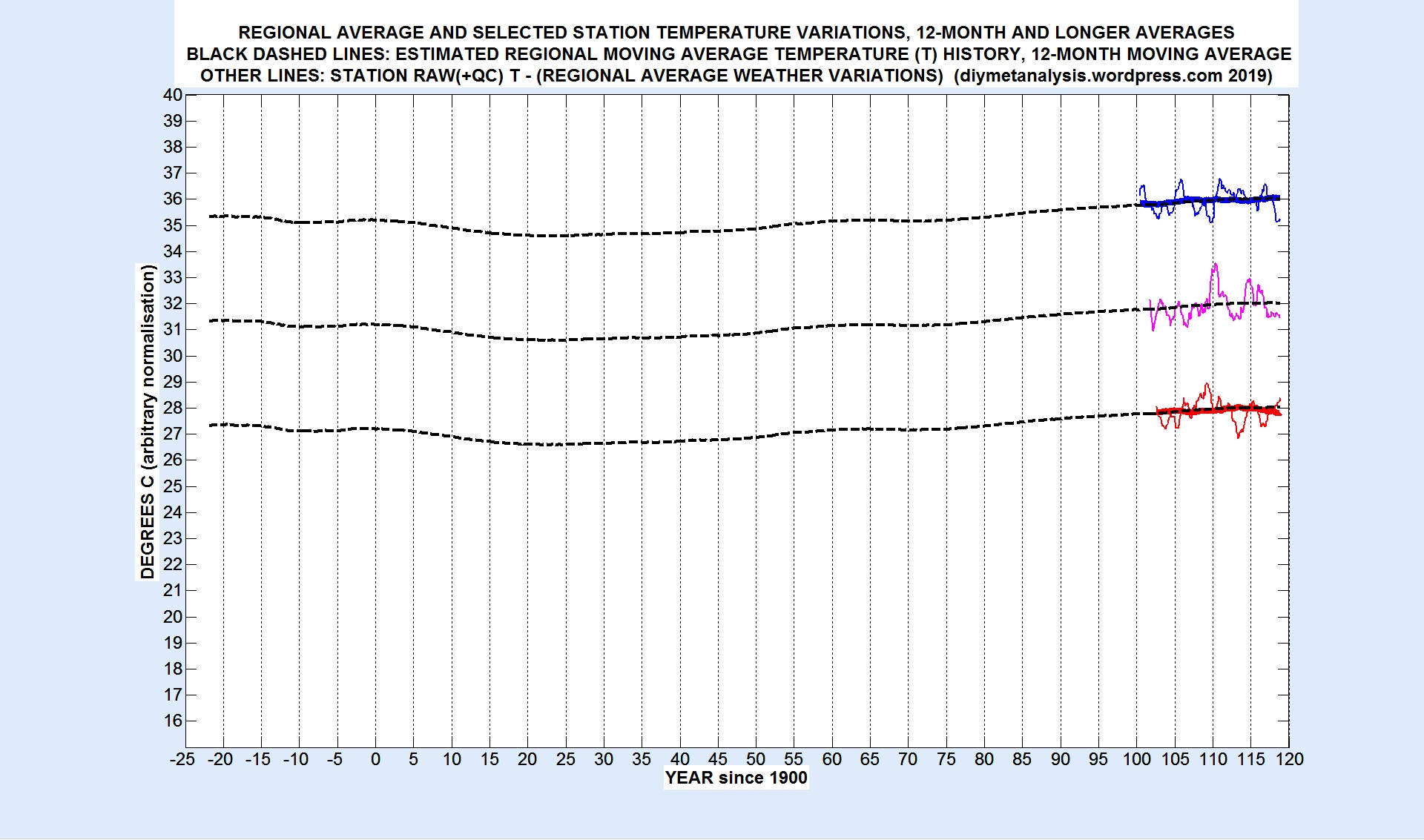
The following set of figures show ALL the data examined, including the periods and stations selected for exclusion, in order of increasing start date. The first few figures are most important, as they cover the difficult early period when there is little or no error suppression from averaging over many stations. Validation at the level of 12-month averages follows from the large amount of data that is approximately parallel to the regional moving average. Similar plots, not shown in this example, were examined for individual months. Station names, start dates, and indices in the alphabetical list of stations at the end of the post, from top to bottom on the plots, are given below each figure.
1 03 1878 ALICE SPRINGS PO
2 24 1882 DARWIN PO
3 11 1888 BOULIA AIRPORT
4 19 1888 CLONCURRY Mc
5 33 1889 MARREE FARINA
06 14 1890 BURKETOWN PO
07 16 1893 CHARLOTTE WATERS
08 30 1898 OLD HALLS CREEK
09 15 1907 CAMOOWEAL
10 40 1910 TENNANT CREEK PO
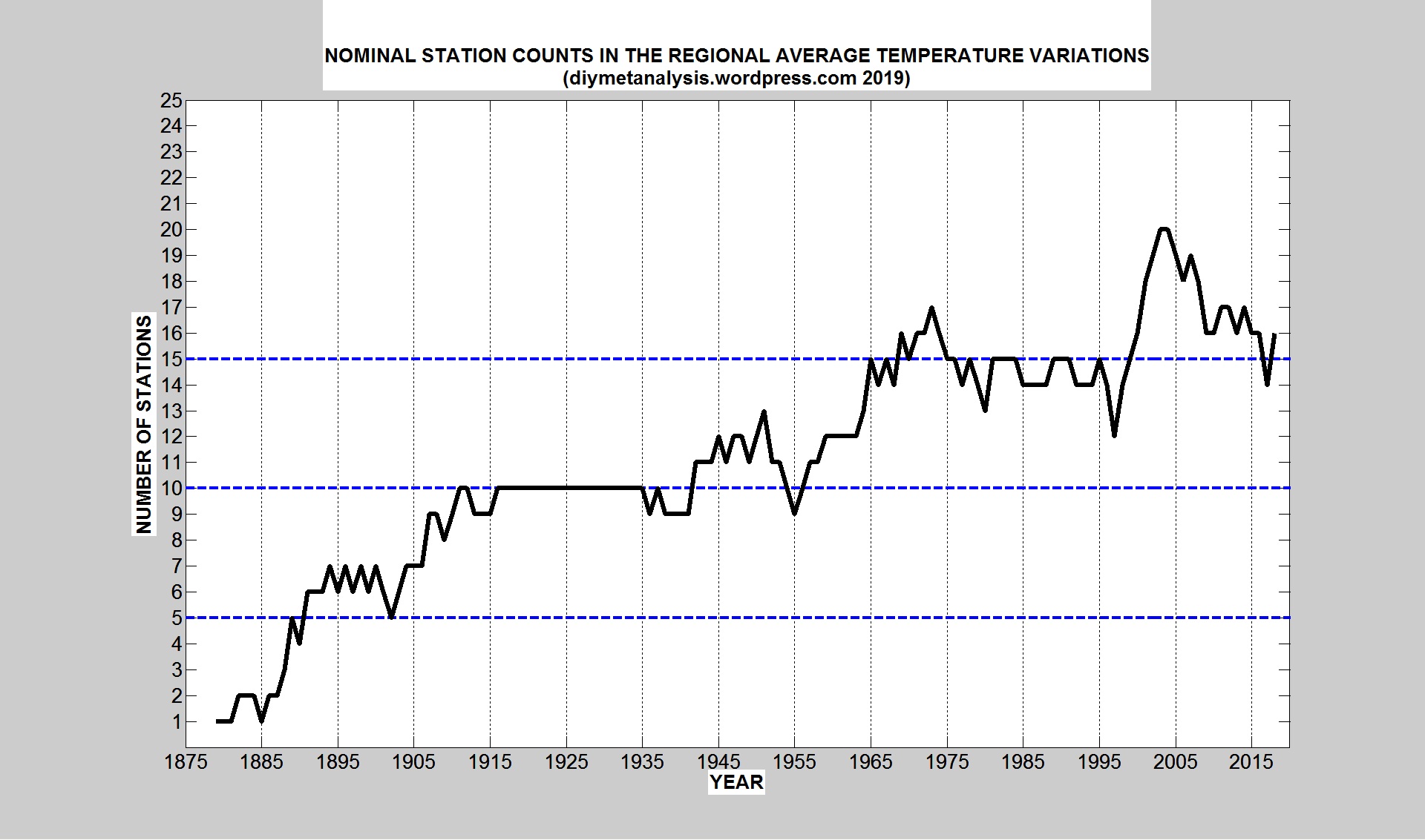
The nominal number of stations used for each year is shown in the following figure, the actual number of stations is generally a bit lower because some periods of data are excluded from regional averaging.
The full list of stations, with their BoM ids, and the parameters that can vary from region to region, are given below, this acts as the configuration information for this version of the regional average, together with the “transition” periods indicated in the validation figures shown above.
*****************************
% NOTES:
% See also comments in ARRAY_INIT, QC_APP, QC_ADD, TR_APP
% STORE_TEMPERATURE_DATA, STORE_RAIN_DATA
%%%%%%%%%%%%%%%%%%%%%%%%%%%%%
%
% 01. Stations best listed in alphabetical order for ease of manual searching
% 02. For composite groups (e.g. PO and airport) latest is first
% 03. stations matrix, D = 1 means include in regional average Deviations
% 04. stations matrix, A = 1 means include in regional moving Averages
% 05. stations matrix, middle date used for display normalisation
% (no direct effect whatsoever on the outputs)
% 06. QC files allow manual setting of temperatures via QC_APP
% 07. QC files also allow manual temperature shifts via QC_ADD
% 08. QC NaNs are set in station QC files to remove data deemed invalid,
% (especially useful when invalid data occurs near transition boundaries)
% 09. TR files allow manual setting of “transitions” and whether or not
% the transition period contributes to regional-av deviations
% 10. STORE_TEMPERATURE_DATA stores the user-modified temperature data
% 11. STORE_TEMPERATURE_DATA stores transition information (see TR_APP)
% 12. STORE_RAIN_DATA stores rainfall totals
% 13. Transitions can be turned off globally using trans_ON = 0
% 14. Flag = 1 in transitions means EXCLUDE period from regional DEVIATIONS
% 16. Flag = 0 in transitions means INCLUDE in regional DEVIATIONS (used for
% slow transitions, such as gradual UHI and vegetation growth)
%







 DIY MET ANALYSIS